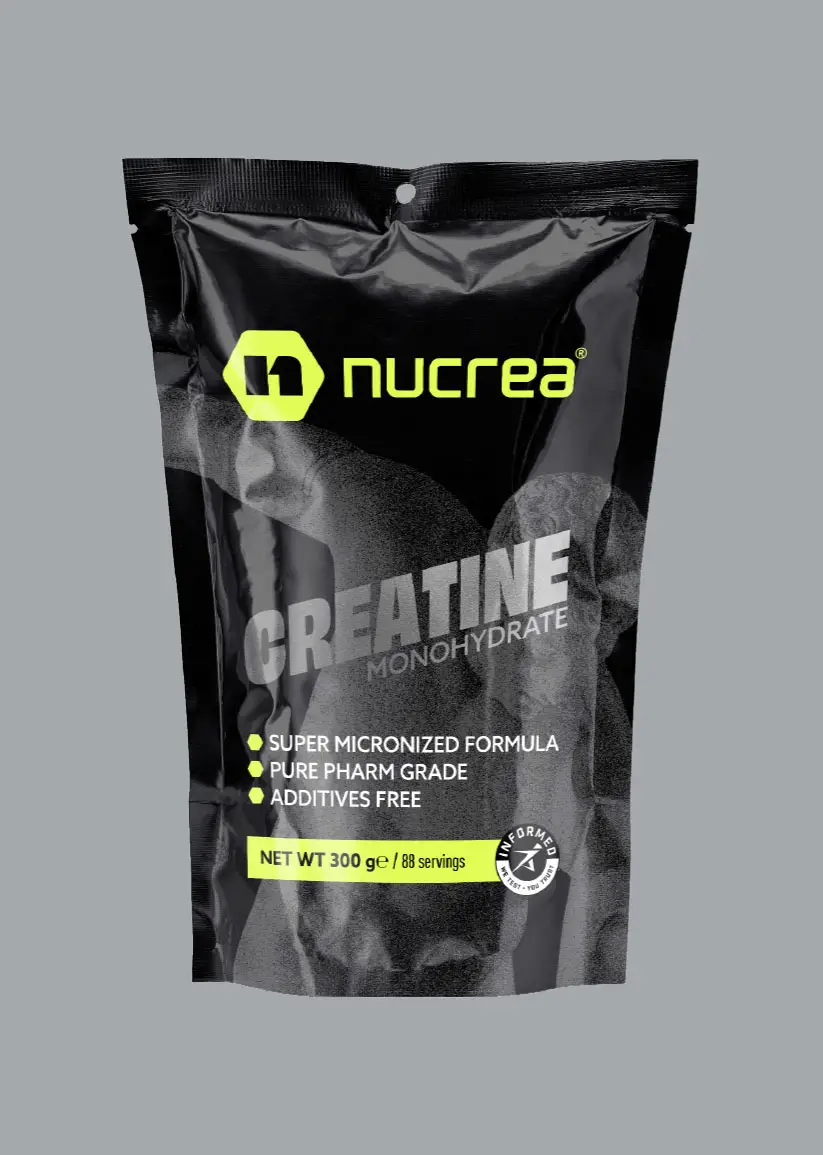
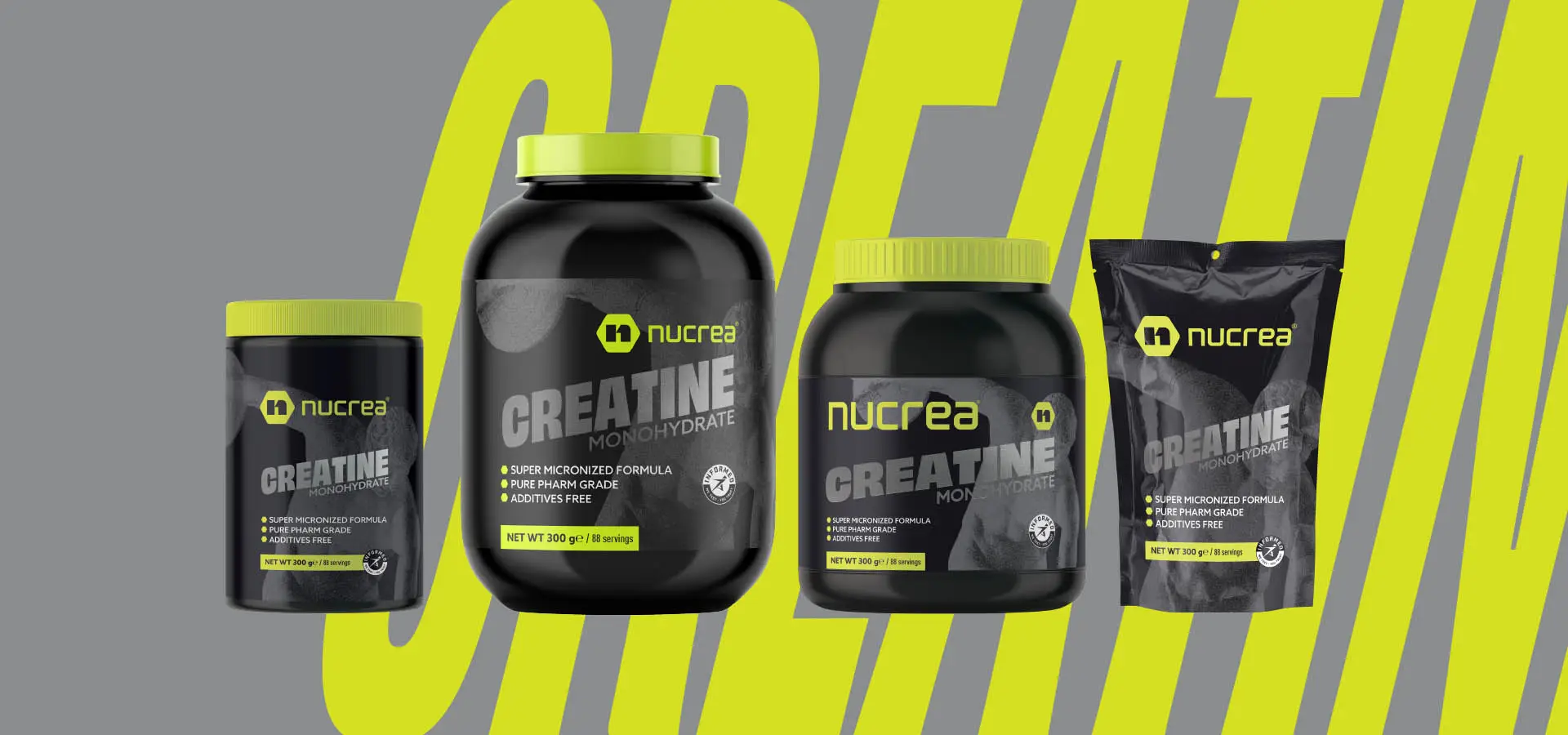
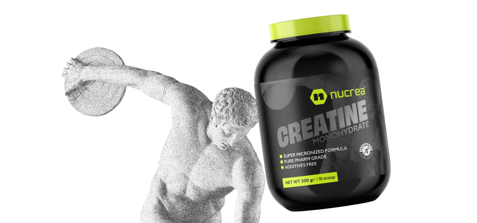
Nucrea® is a premium creatine supplement brand built on purity, performance, and science-backed results. The goal of this project was to develop a comprehensive visual identity system that communicates strength, precision, and trust—values that align with the brand’s commitment to athletes, fitness enthusiasts, and high-performance lifestyles.
This project involved creating a complete brand guideline document that establishes the foundation for Nucrea’s visual language across all platforms and media. Key deliverables included:
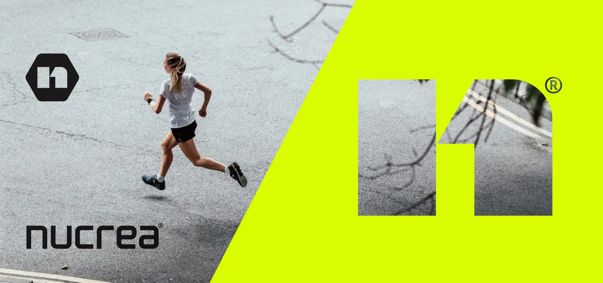
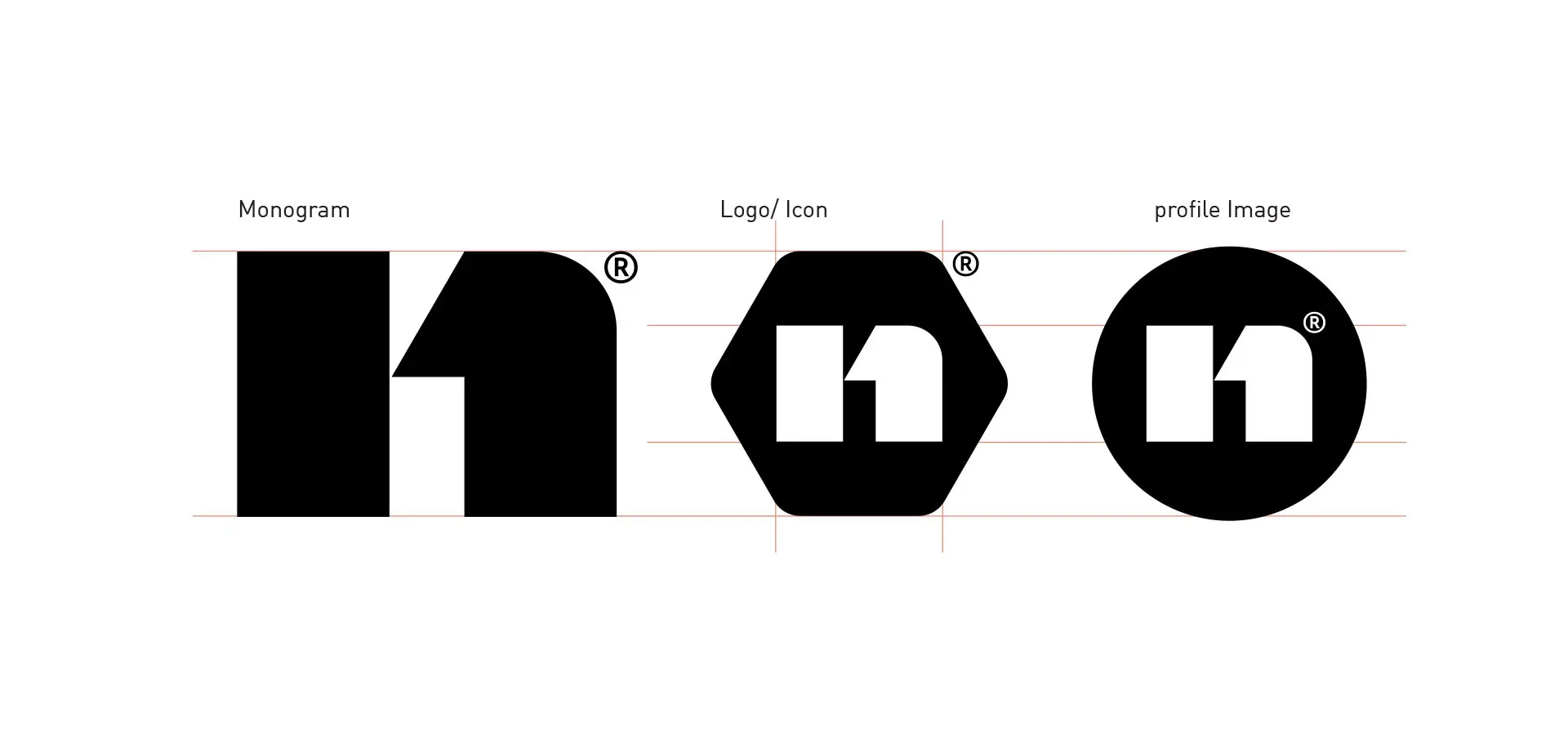
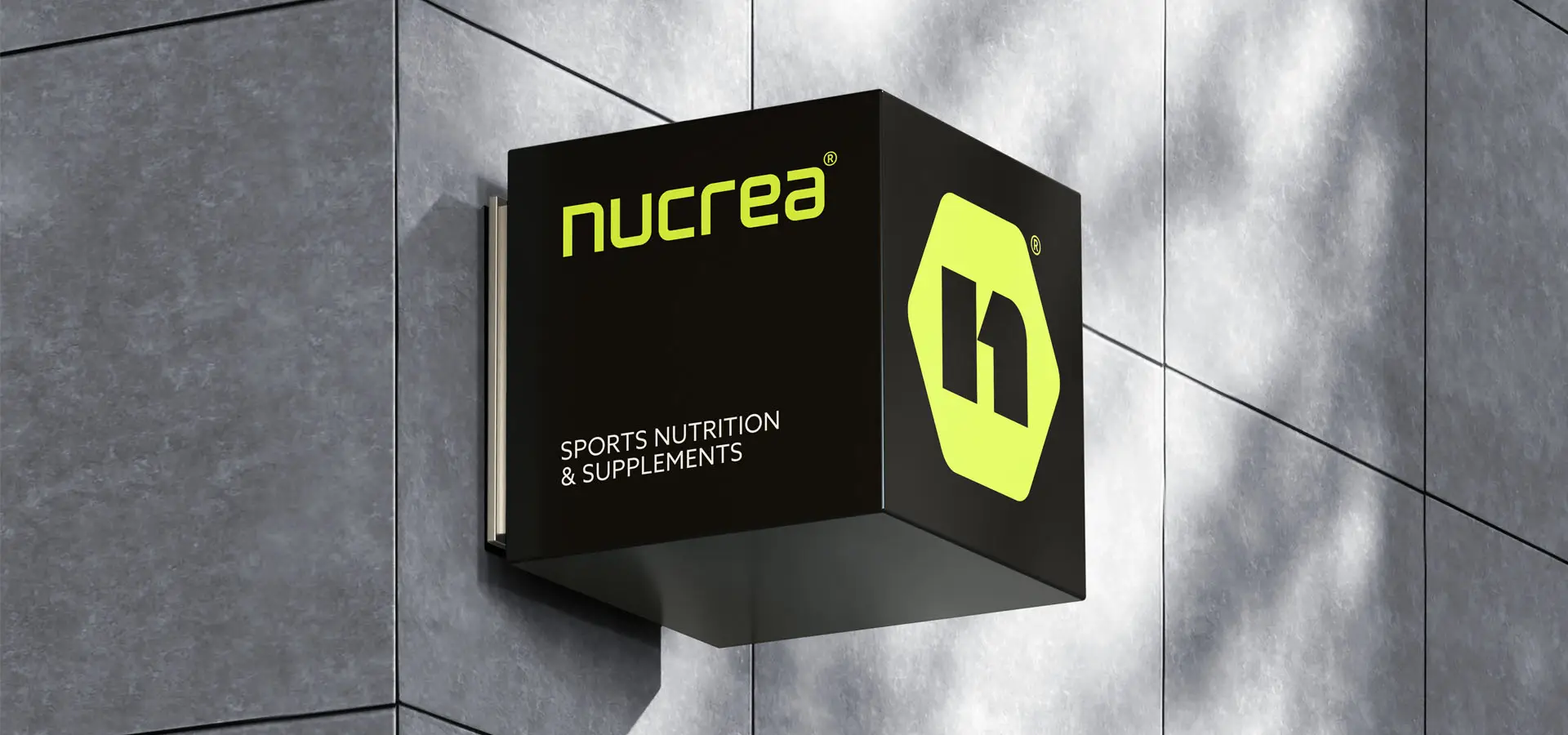
Logo System: Main logo, monogram, icon, profile image variations, official versions, and usage rules.
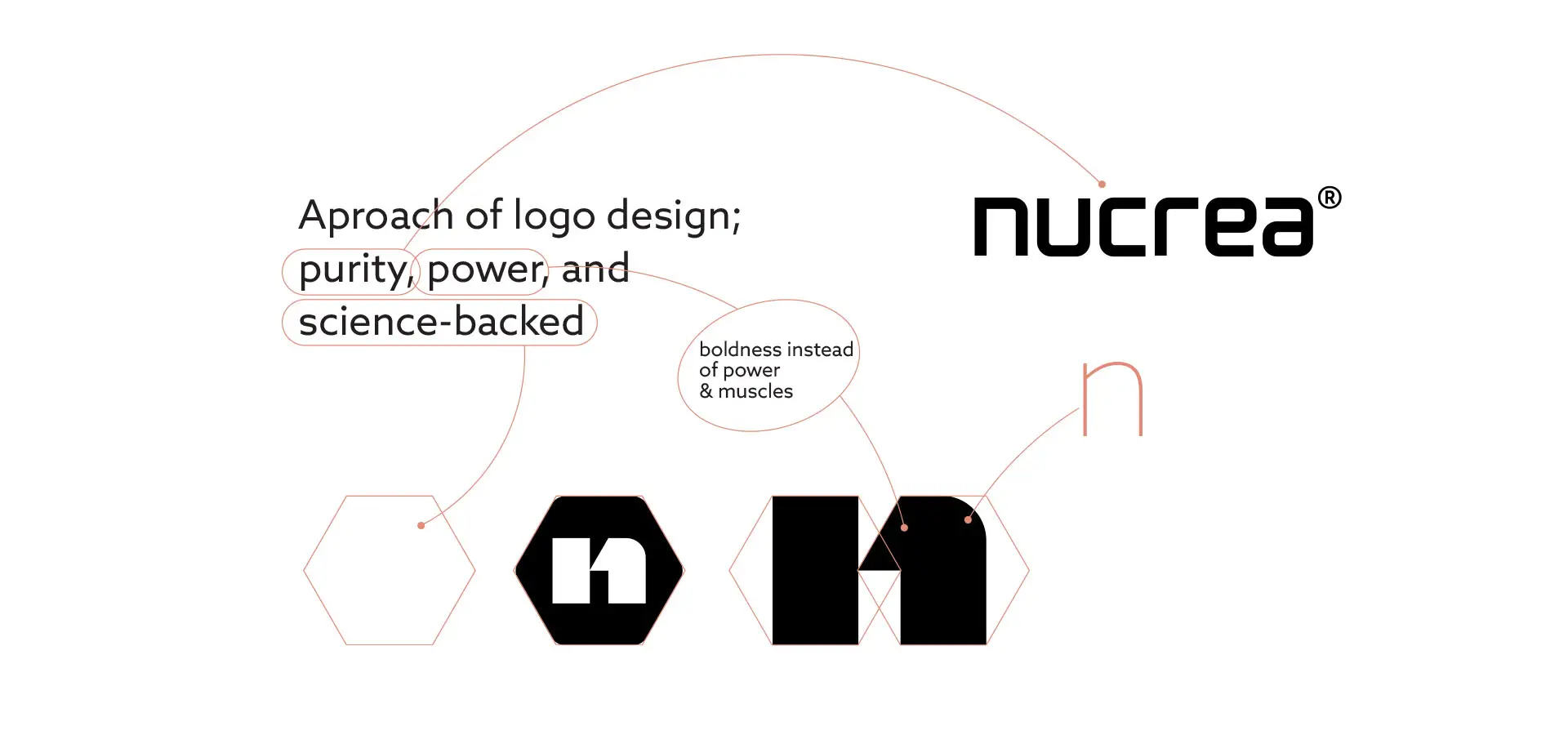
Logo DNA & Analysis: Defined proportions, spacing, and protected areas to maintain brand integrity.
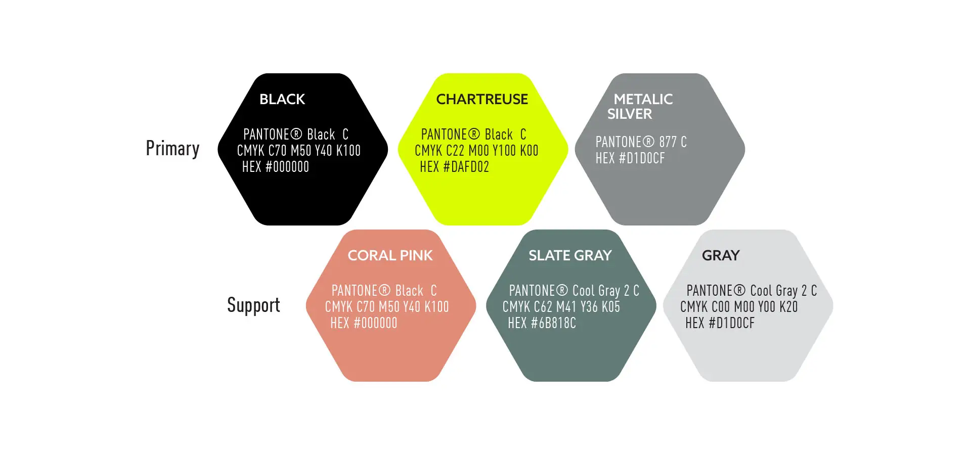
Color Palette: Primary and supporting color system, including metallics, to convey energy and modernity.
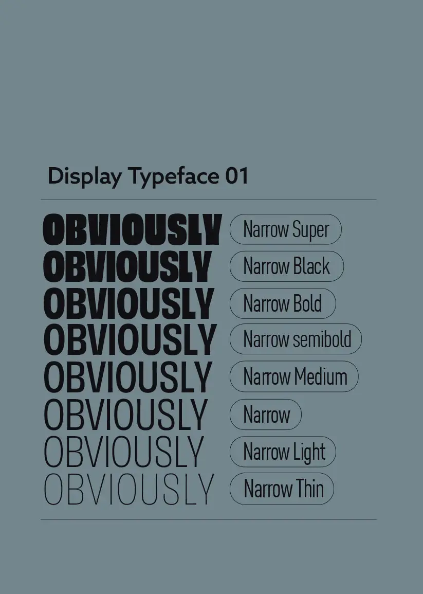
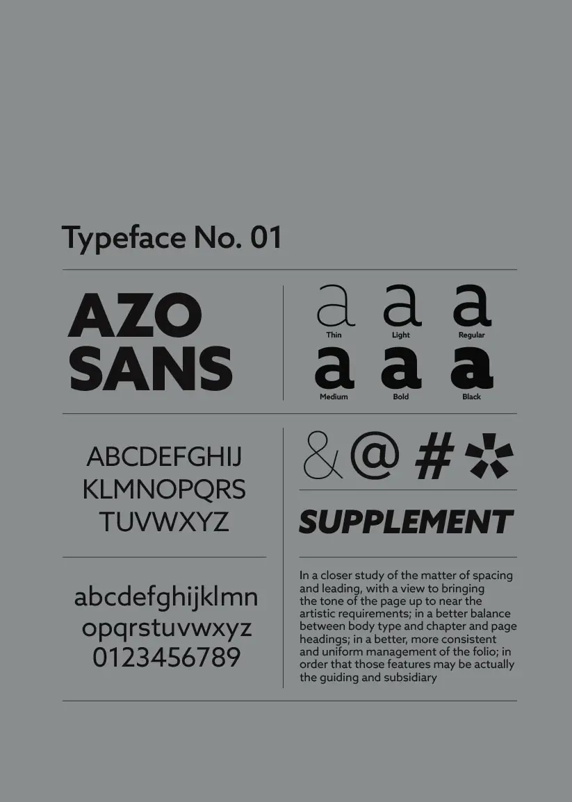
Typography: Carefully selected typefaces for maximum legibility and brand consistency.
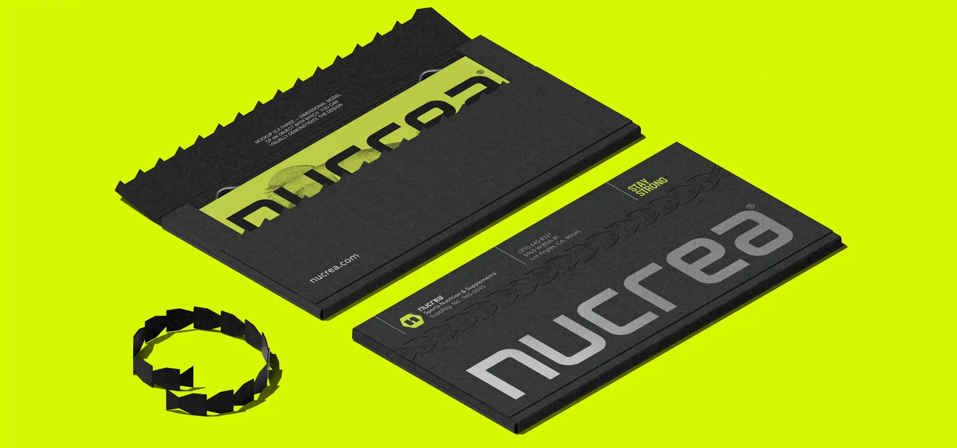
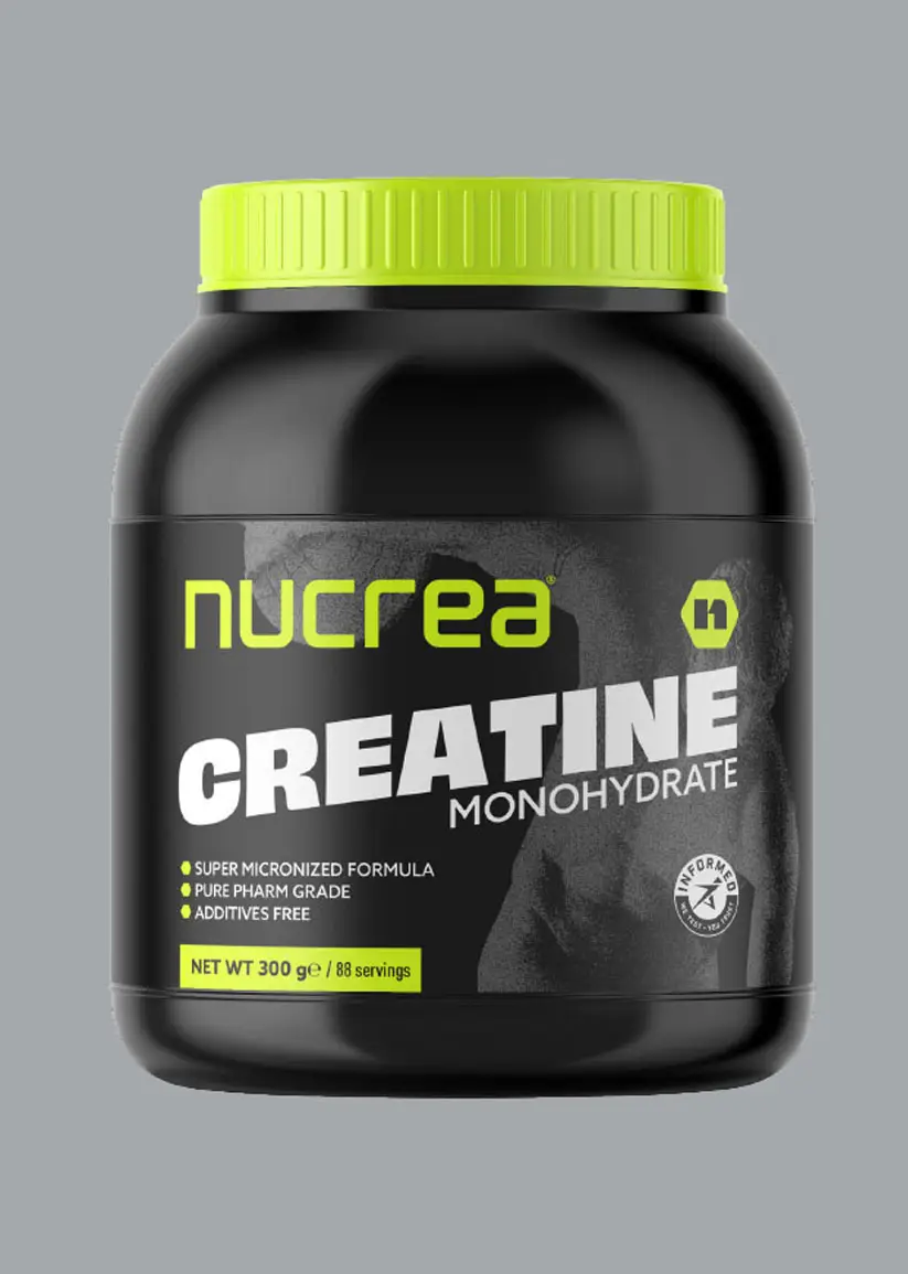
Stationery & Packaging: Templates for business cards, letterheads, and sample packaging concepts.
Do’s & Don’ts: Clear prohibited uses to avoid brand dilution across digital and print applications.
The design direction was inspired by purity, power, and science, aligning with the brand’s core promise of clean and effective supplementation. Every element—from the bold logotype to the chartreuse accent color—was chosen to reinforce a performance-driven, premium feel while staying versatile for e-commerce, social media, and packaging.
With this guideline in place, Nucrea® now has a cohesive, future-proof visual identity that enables consistent execution across all touchpoints. It empowers designers, marketers, and manufacturers to uphold the same high standard, ensuring the brand is instantly recognizable and trustworthy in a competitive sports nutrition market.
