Hello There!

We craft ideas into visuals that connect, inspire, and convert.

School & Office Supplies

Write with intention. Design with purpose.

WRYTAO is a school and office supply brand built around a simple idea: writing is more than function, it’s a rhythm, a flow, and a personal expression. Vizomix developed a complete visual identity and product system that transforms everyday stationery into a refined, design-led experience.

CLIENT

WRYTAO

SERVICES

Log, branding, web development, Ecommerce Visual developments

INDUSTRIES

School & Office Supplies

Simple & Significant

Create a brand for a highly competitive and commoditized category where most products look identical and compete on price.

The identity needed to:

  1. Stand out on shelves and online marketplaces
  2. Appeal to both students and professionals
  3. Feel modern, expressive, and premium without becoming niche
  4. Scale across products, packaging, and digital platforms

The Goal

Build a cohesive brand system that connects writing, motion, and flow into a recognizable visual language.

The outcome needed to:

  1. Elevate perception beyond generic office supplies
  2. Create consistency across all touchpoints
  3. Support e-commerce performance and retail visibility
  4. Allow flexibility across product lines

Solution

Vizomix developed a flexible identity system centered around movement, rhythm, and modular design.

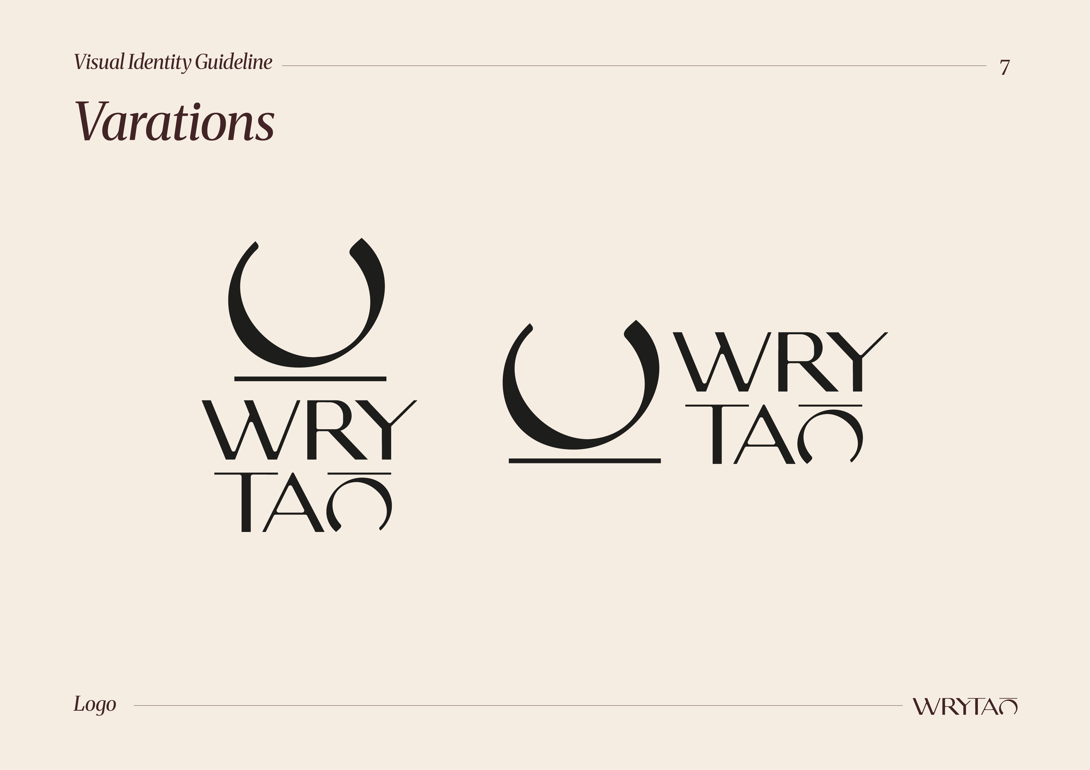
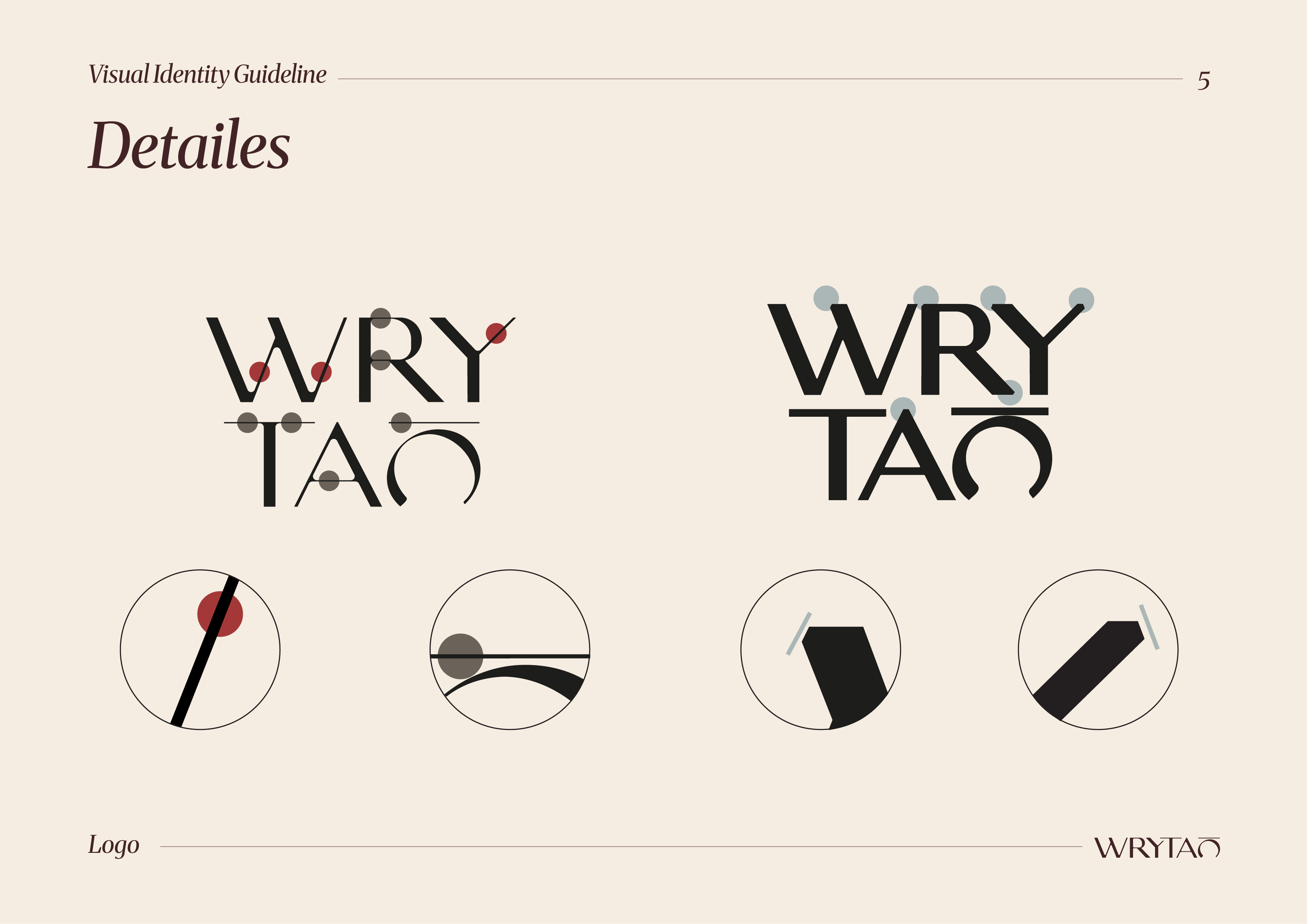
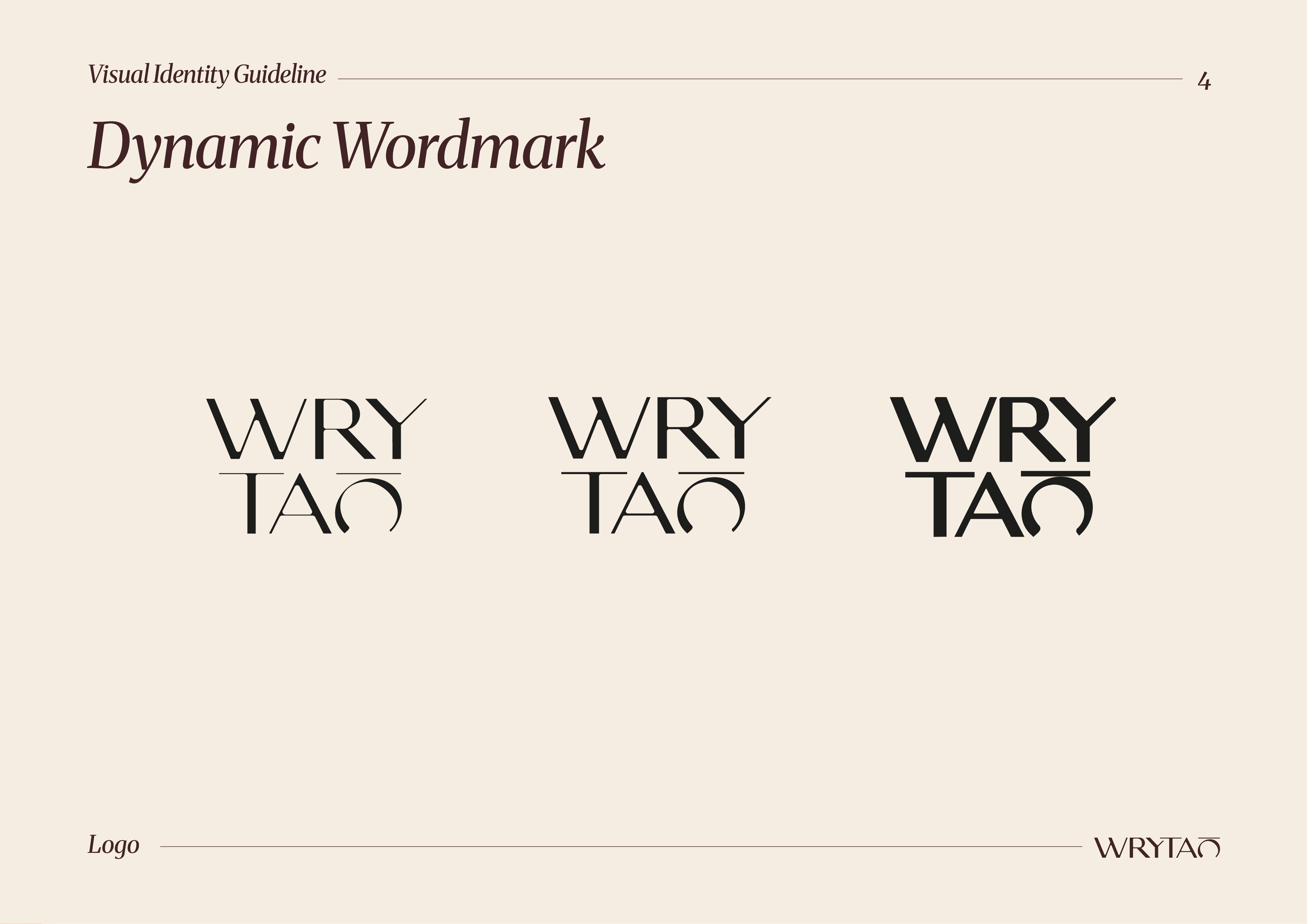
A distinctive typographic logo that balances structure and fluidity. The form subtly reflects motion and writing flow, reinforced through variations and responsive layouts.

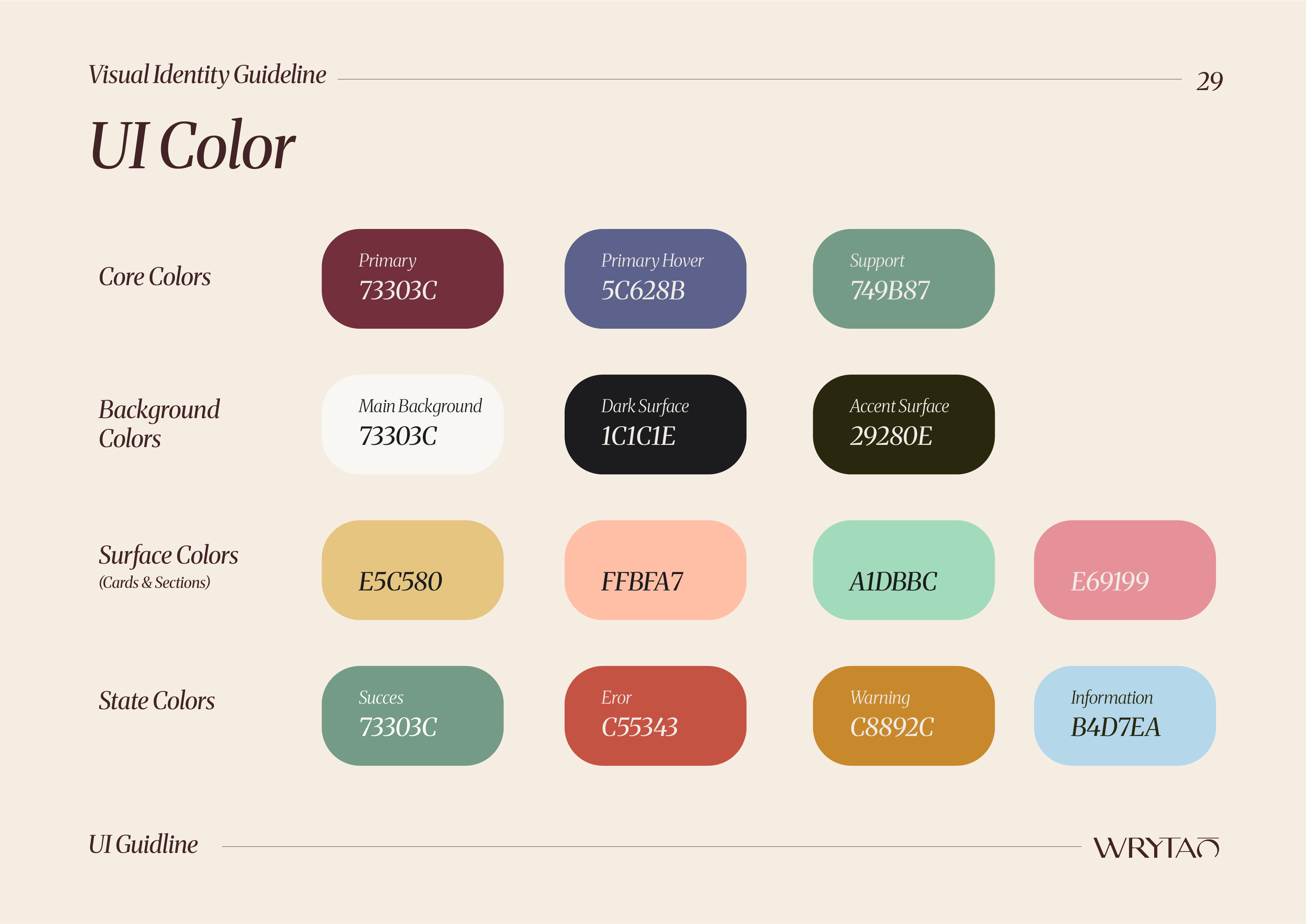
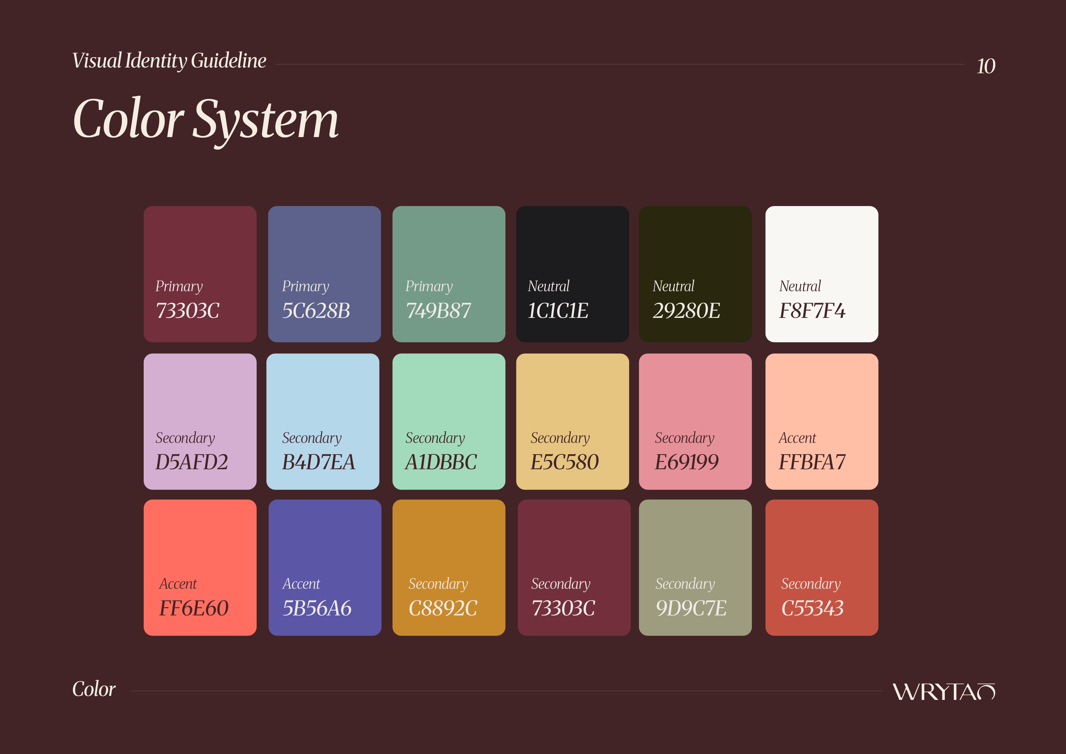
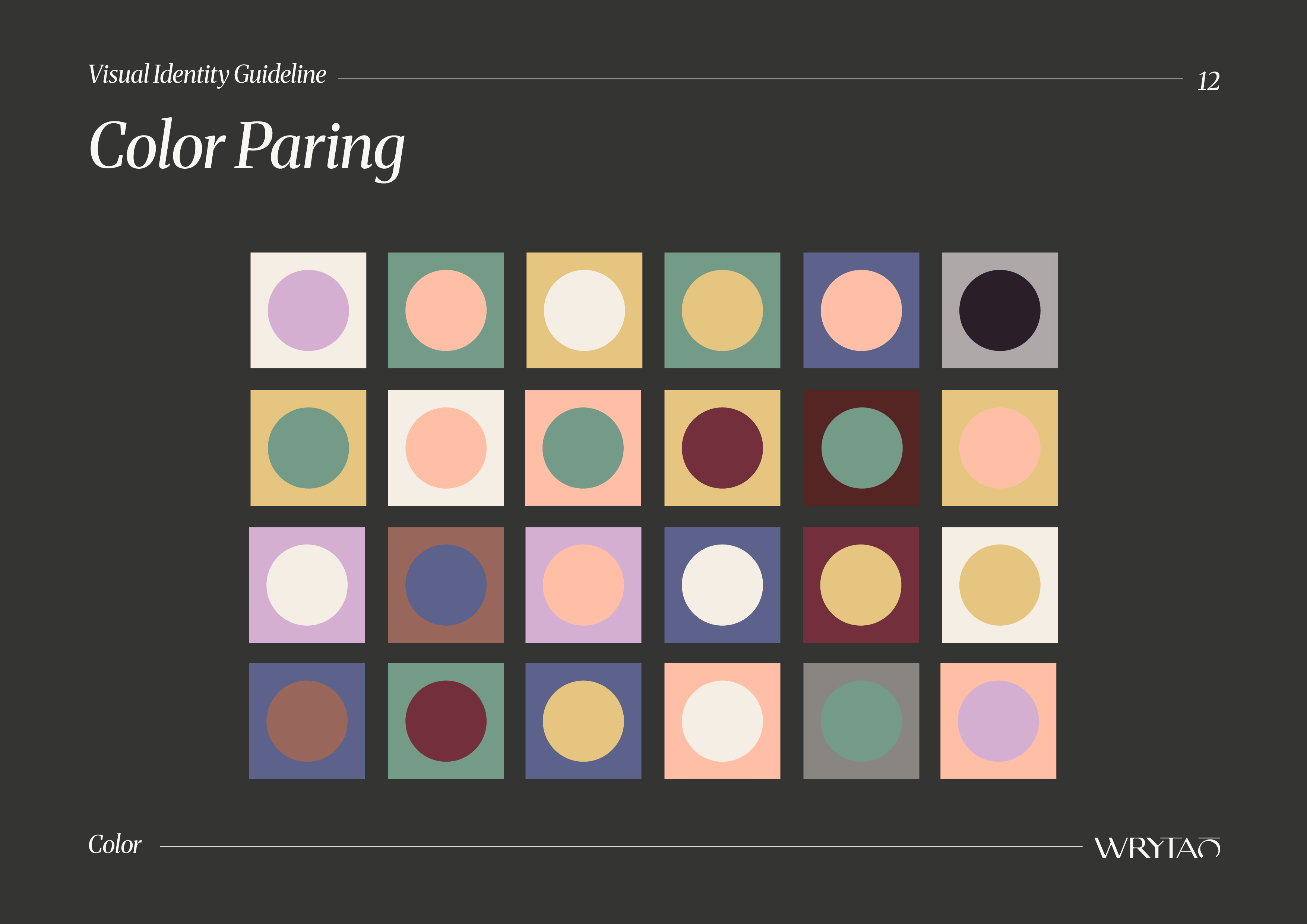
A rich, modern palette combining warm, muted tones with contrasting accents. This allows each product line to feel unique while maintaining brand consistency.

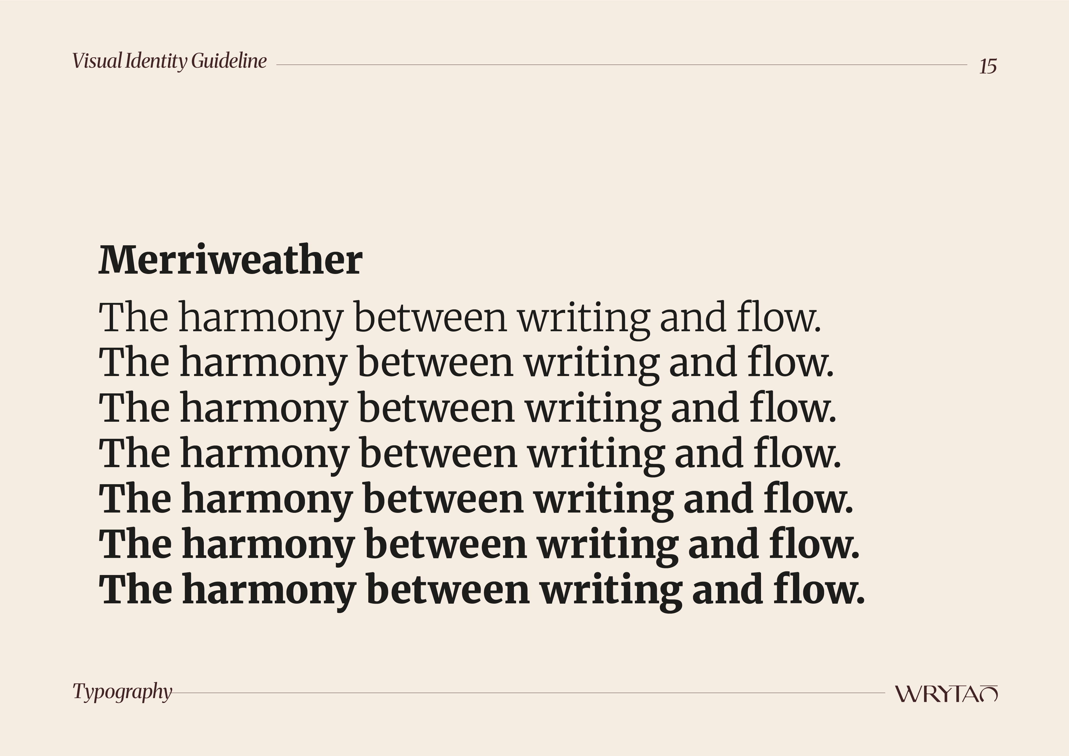
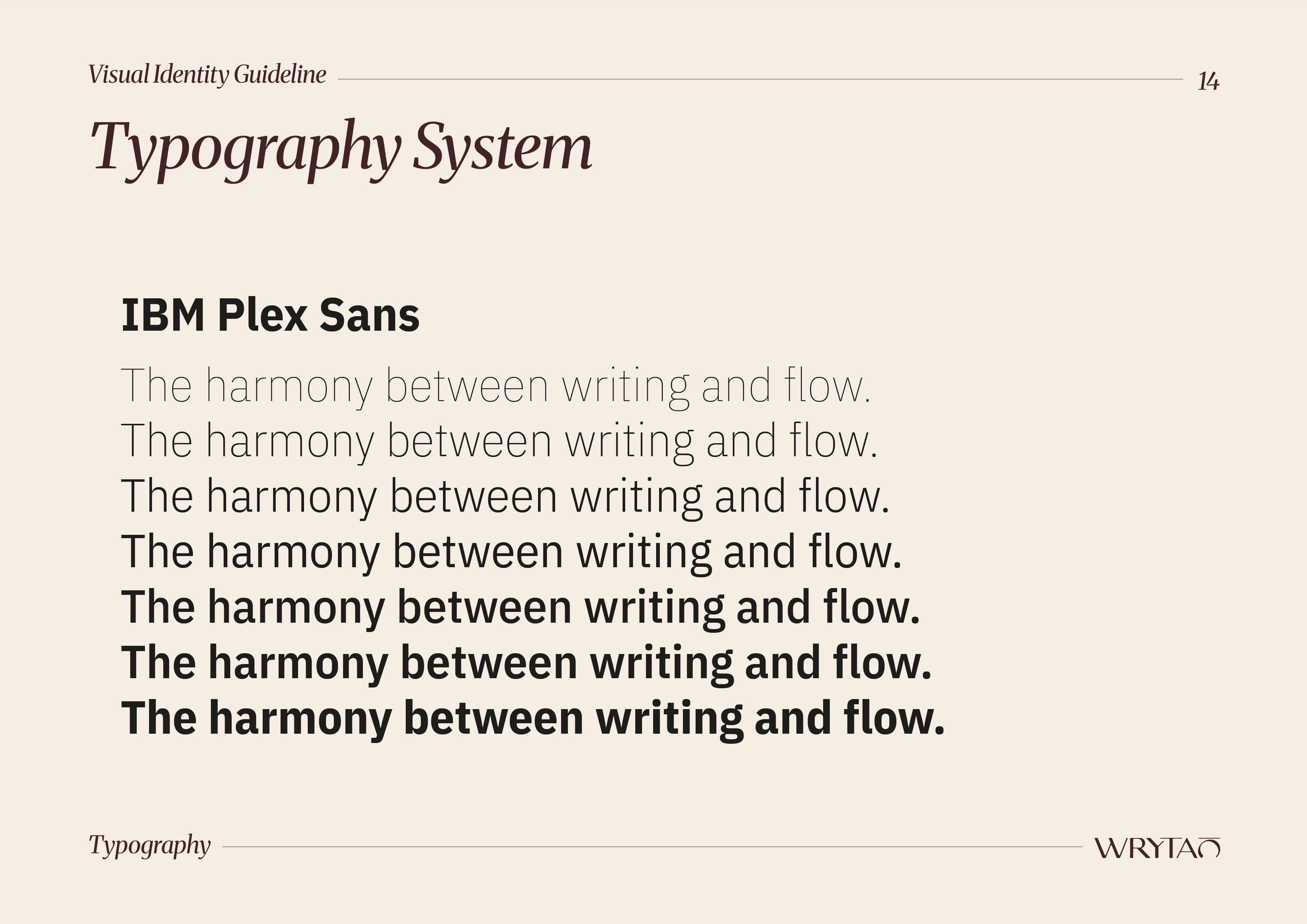
A dual-type approach:
-Merriweather for editorial, expressive headlines
-IBM Plex Sans for clarity and readability
.
This pairing creates a balance between emotion and function.

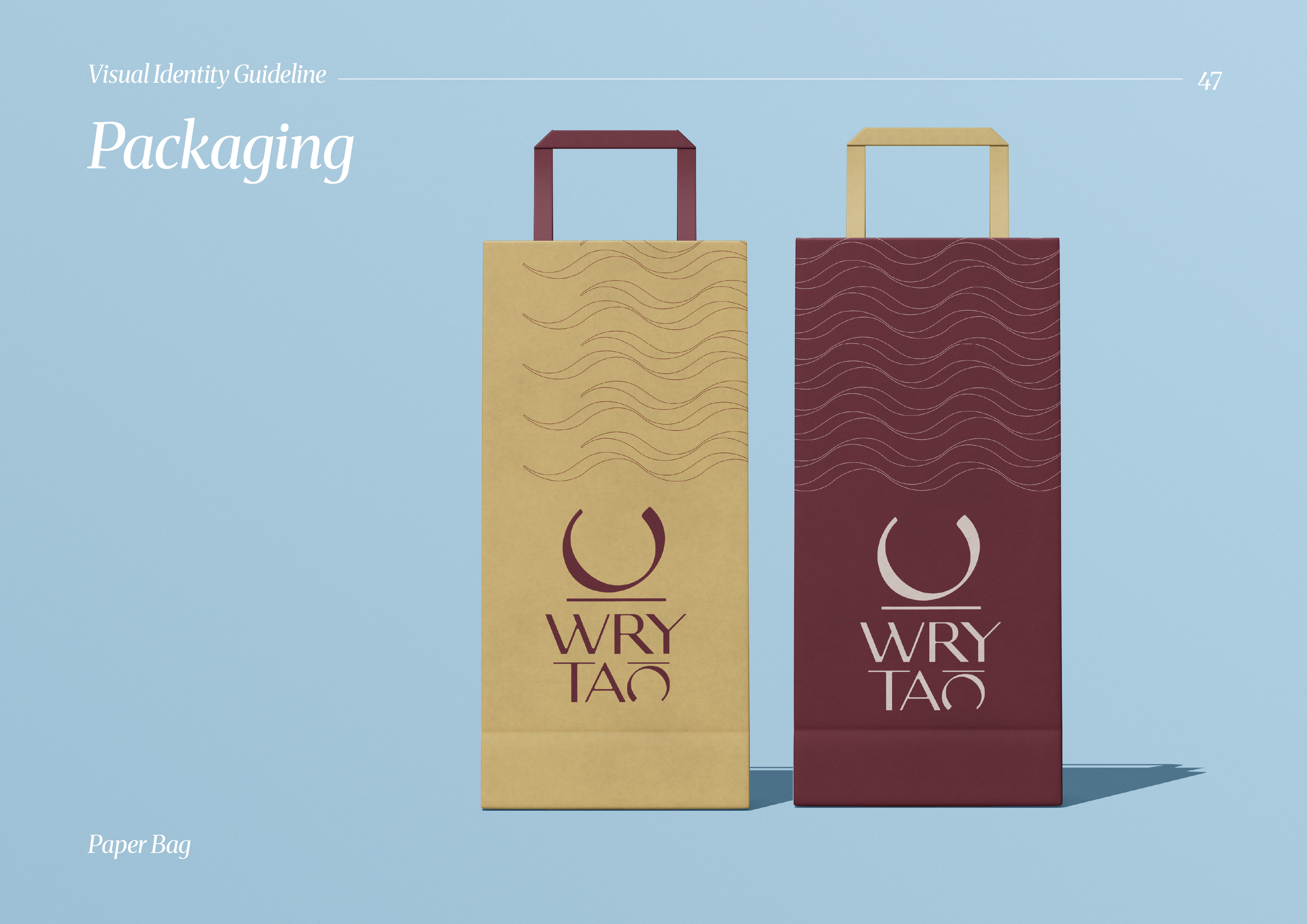
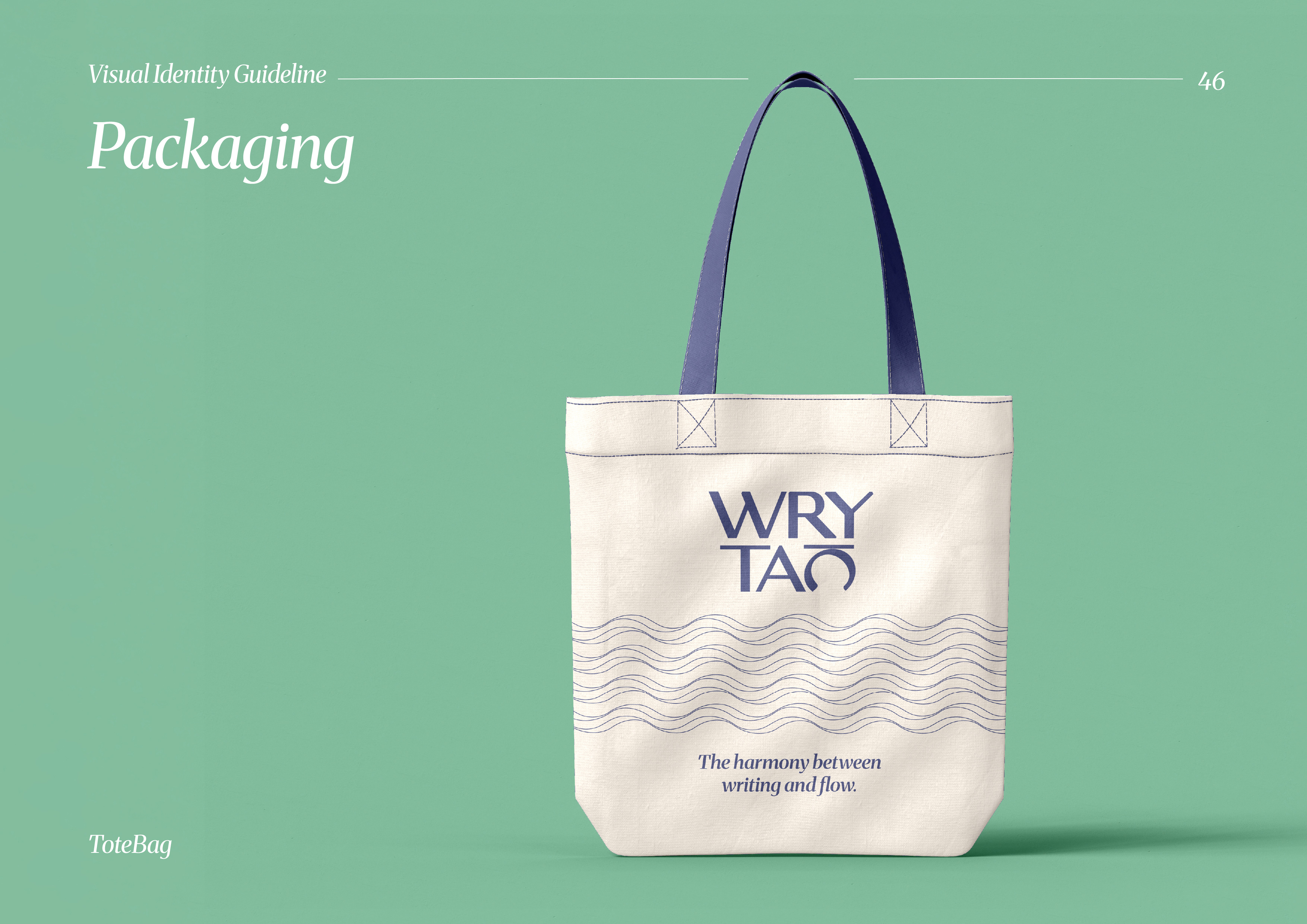
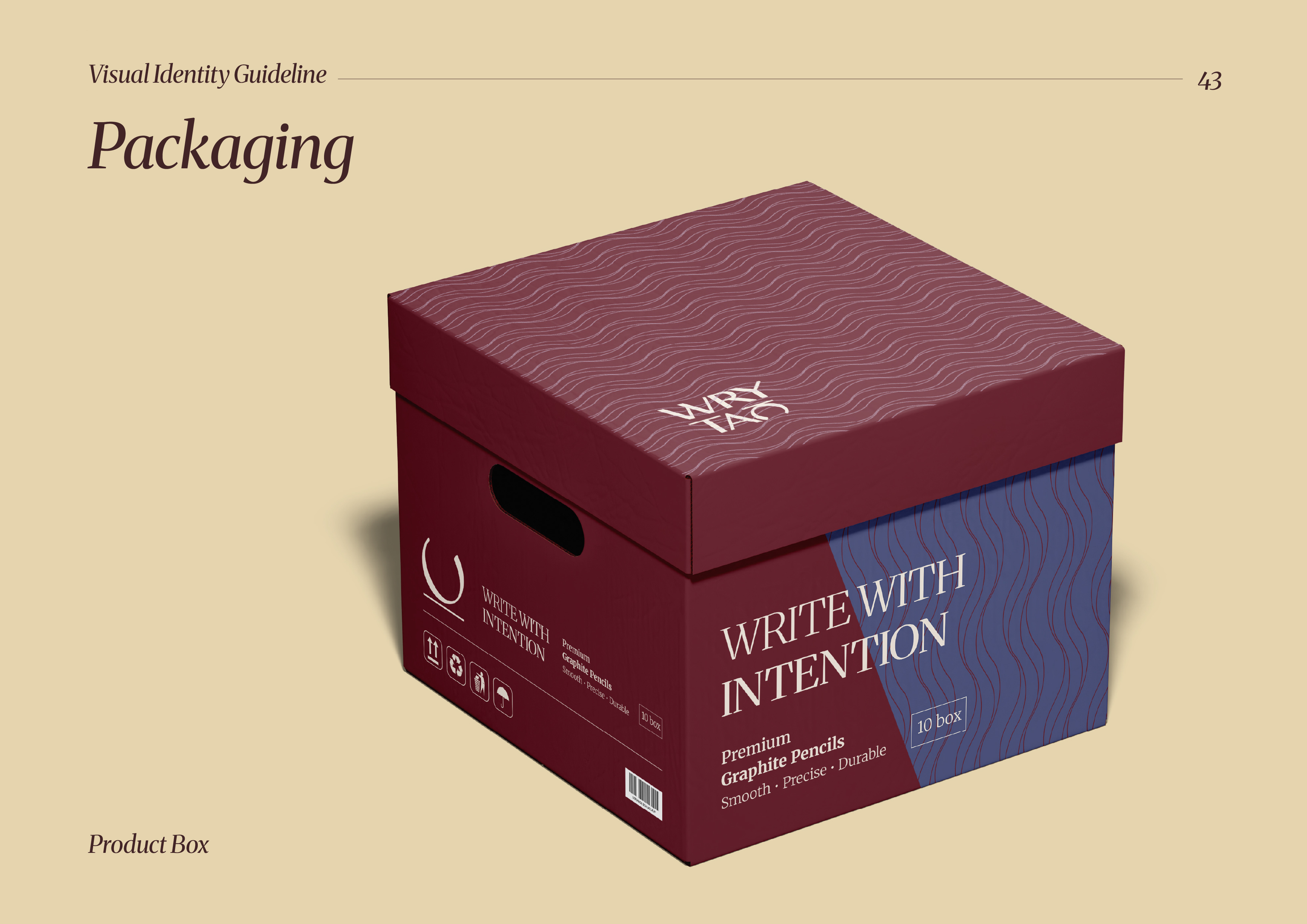
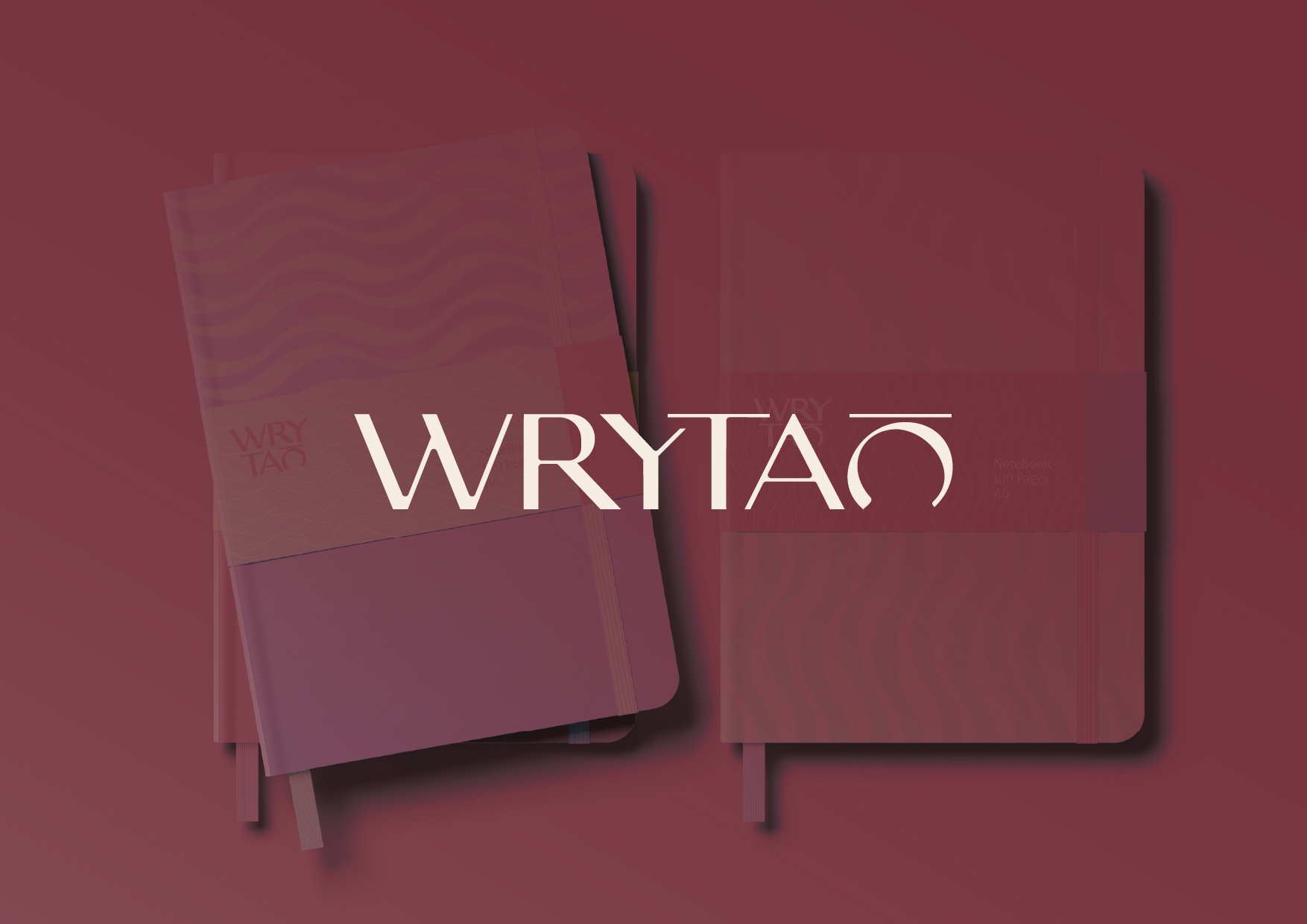
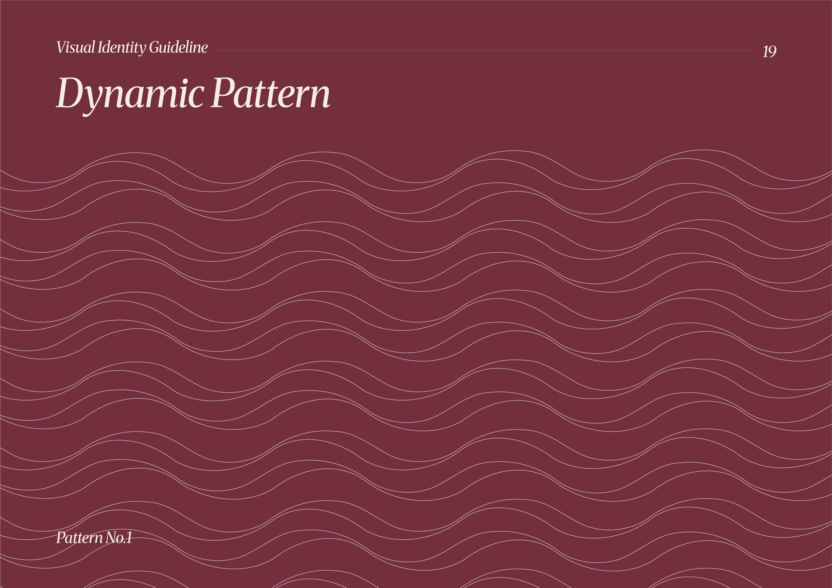
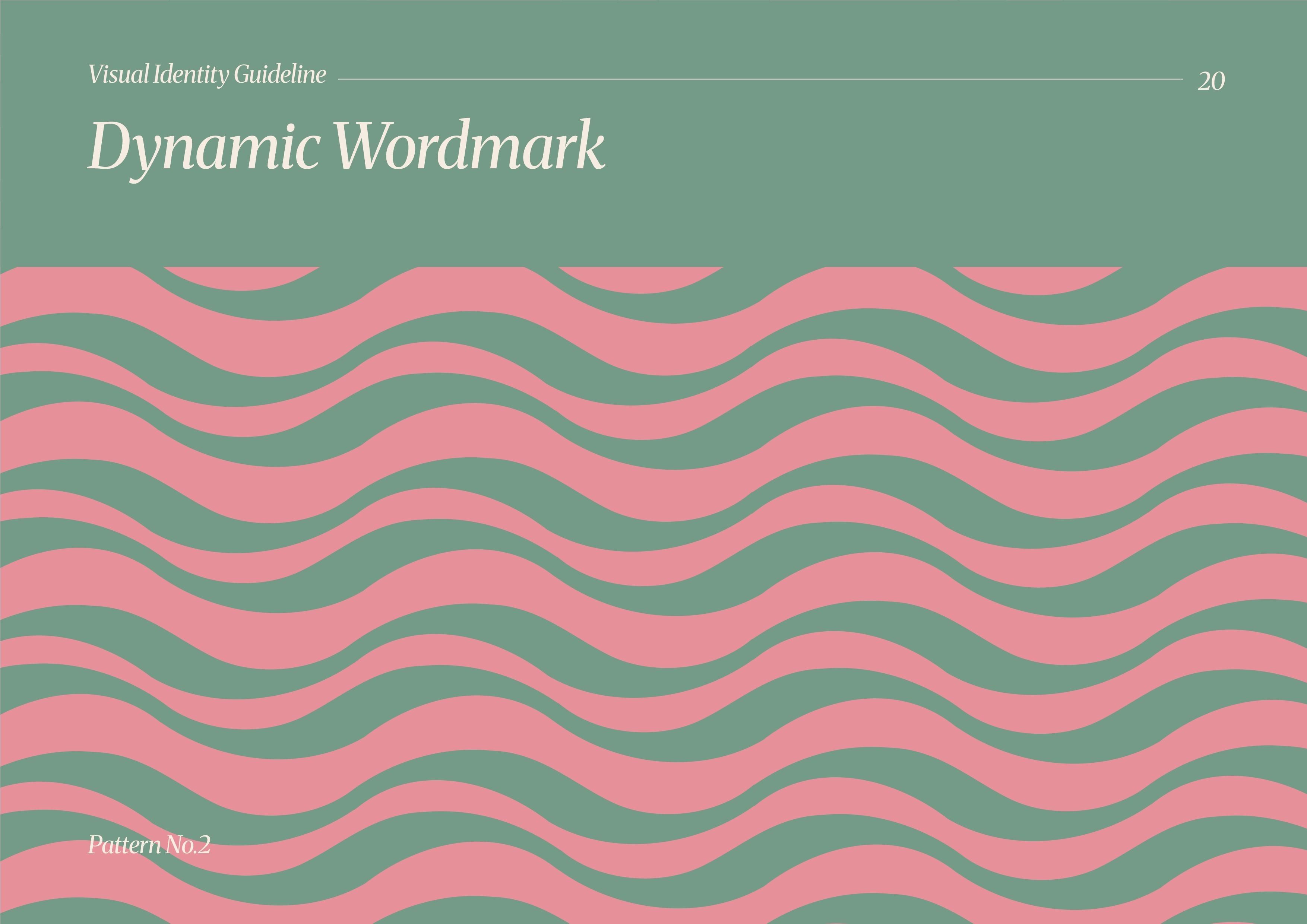
Flow-inspired wave patterns act as a core visual asset across packaging and digital applications. These patterns reinforce the idea of rhythm and continuity in writing.

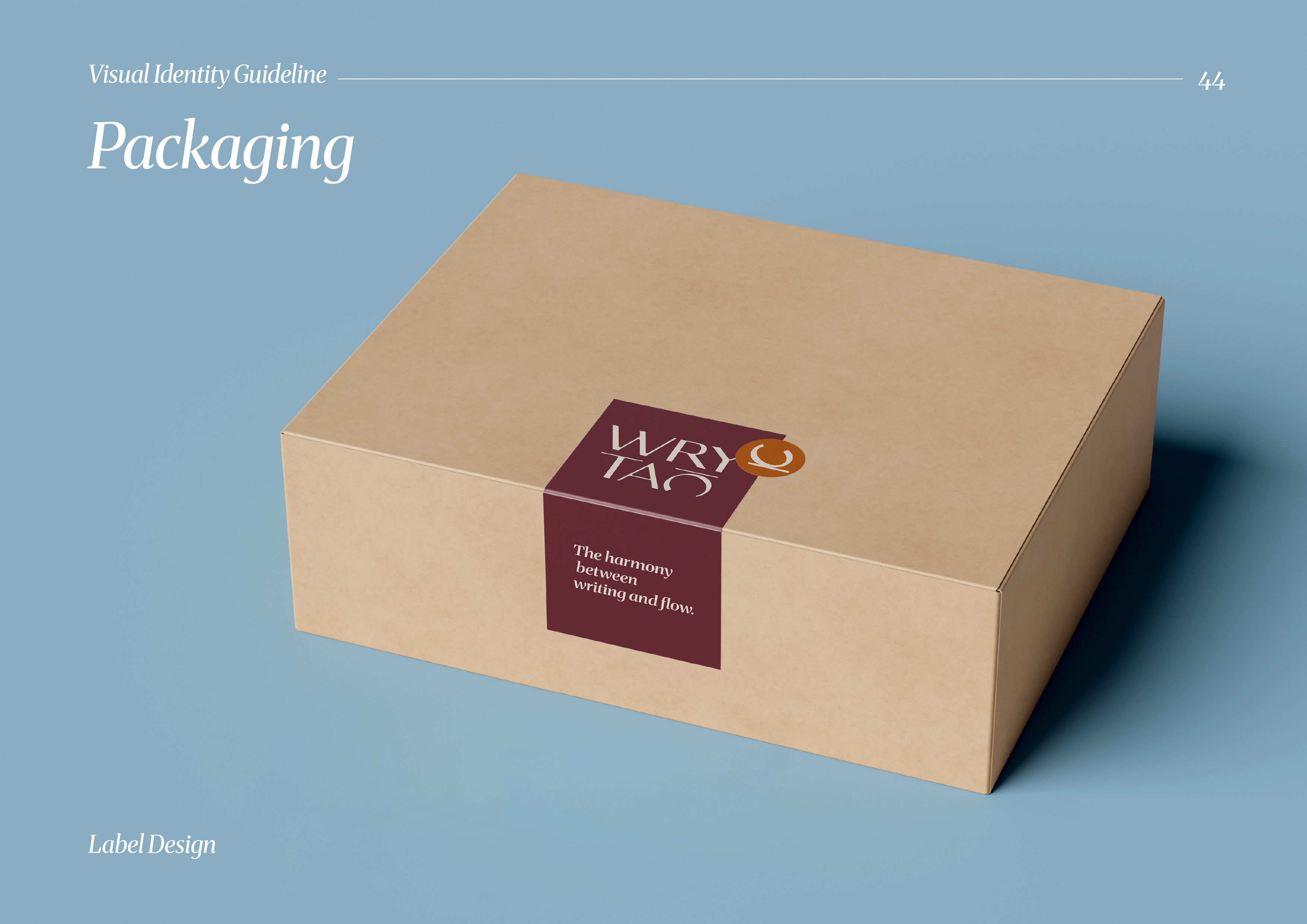
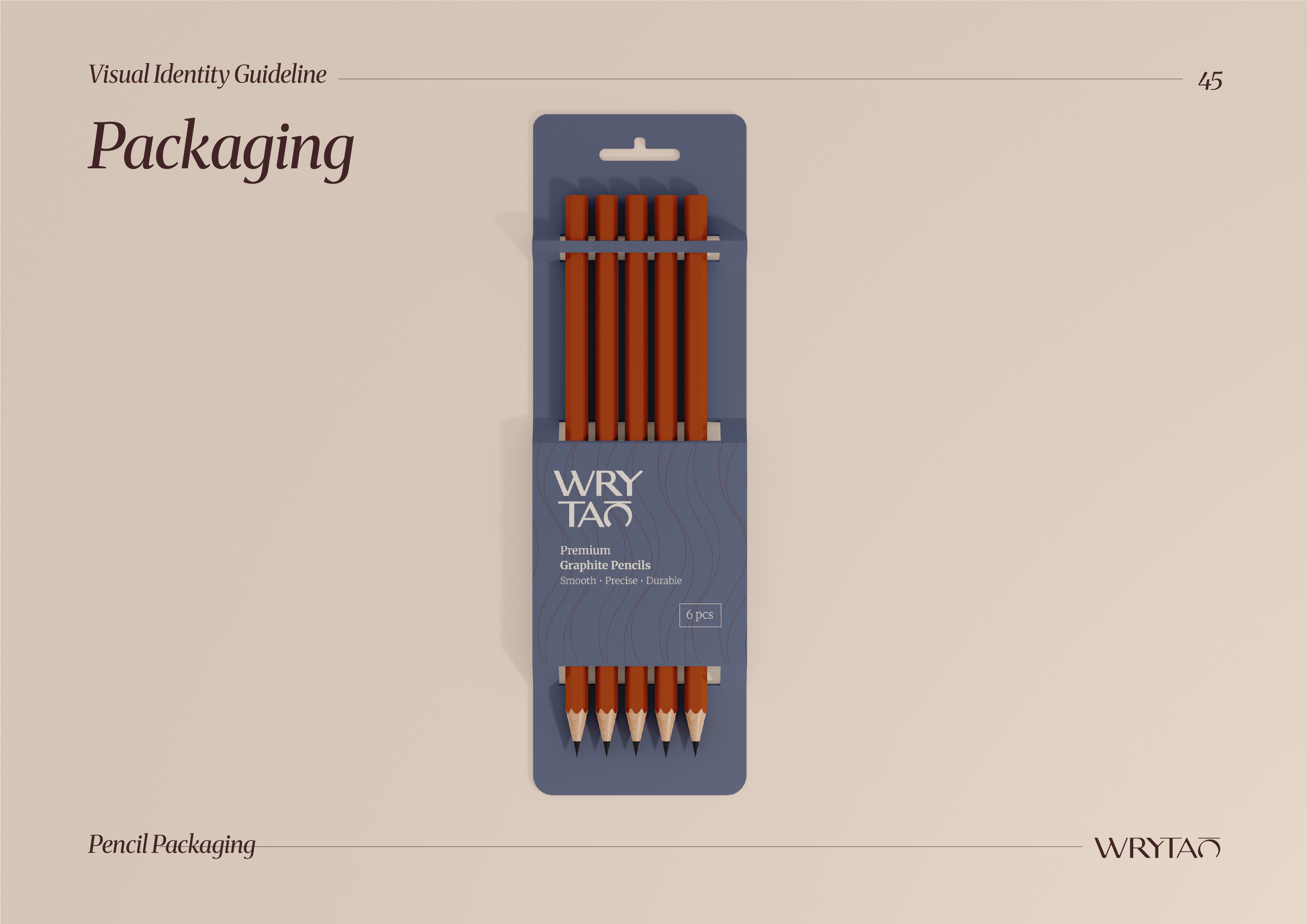
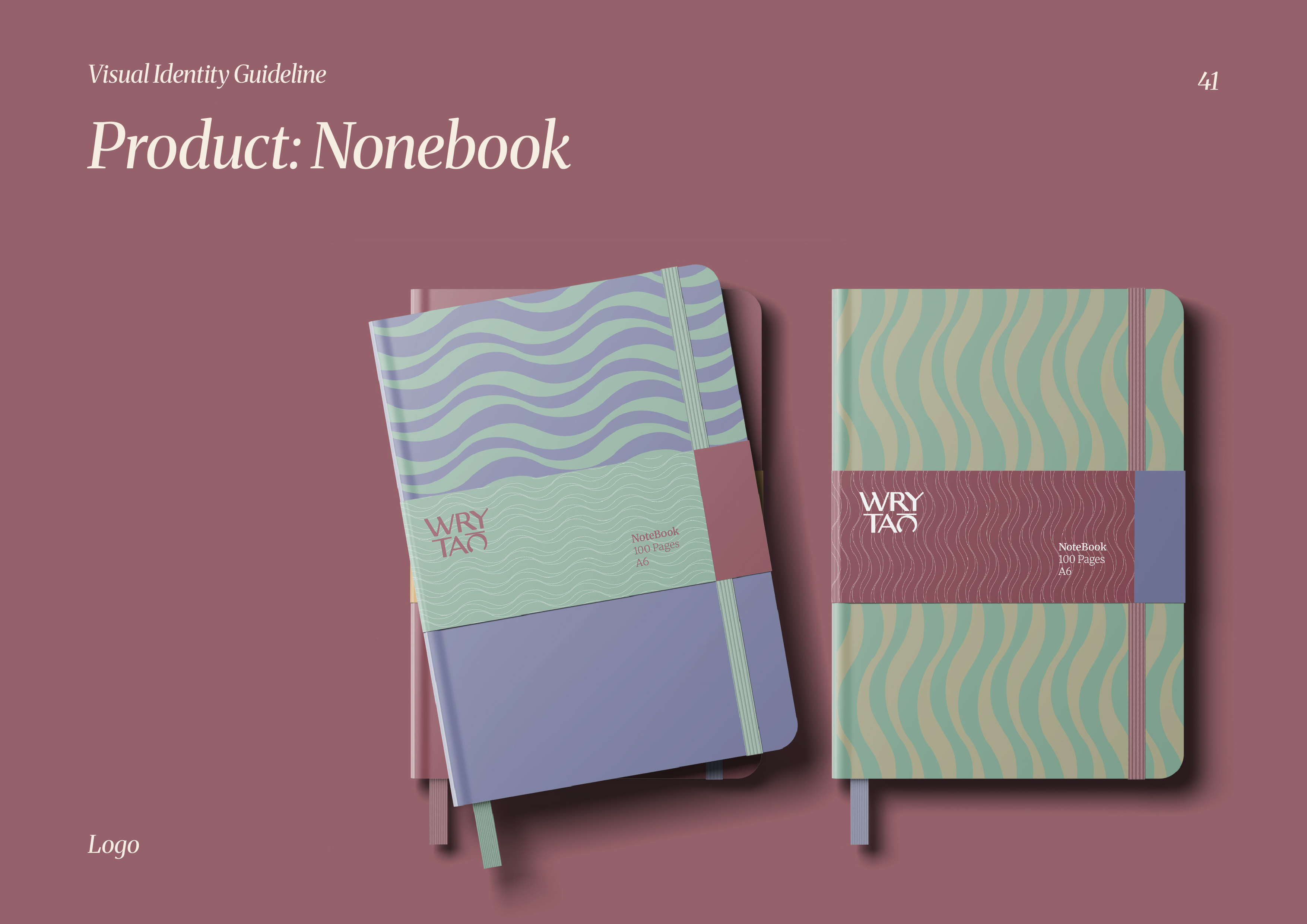
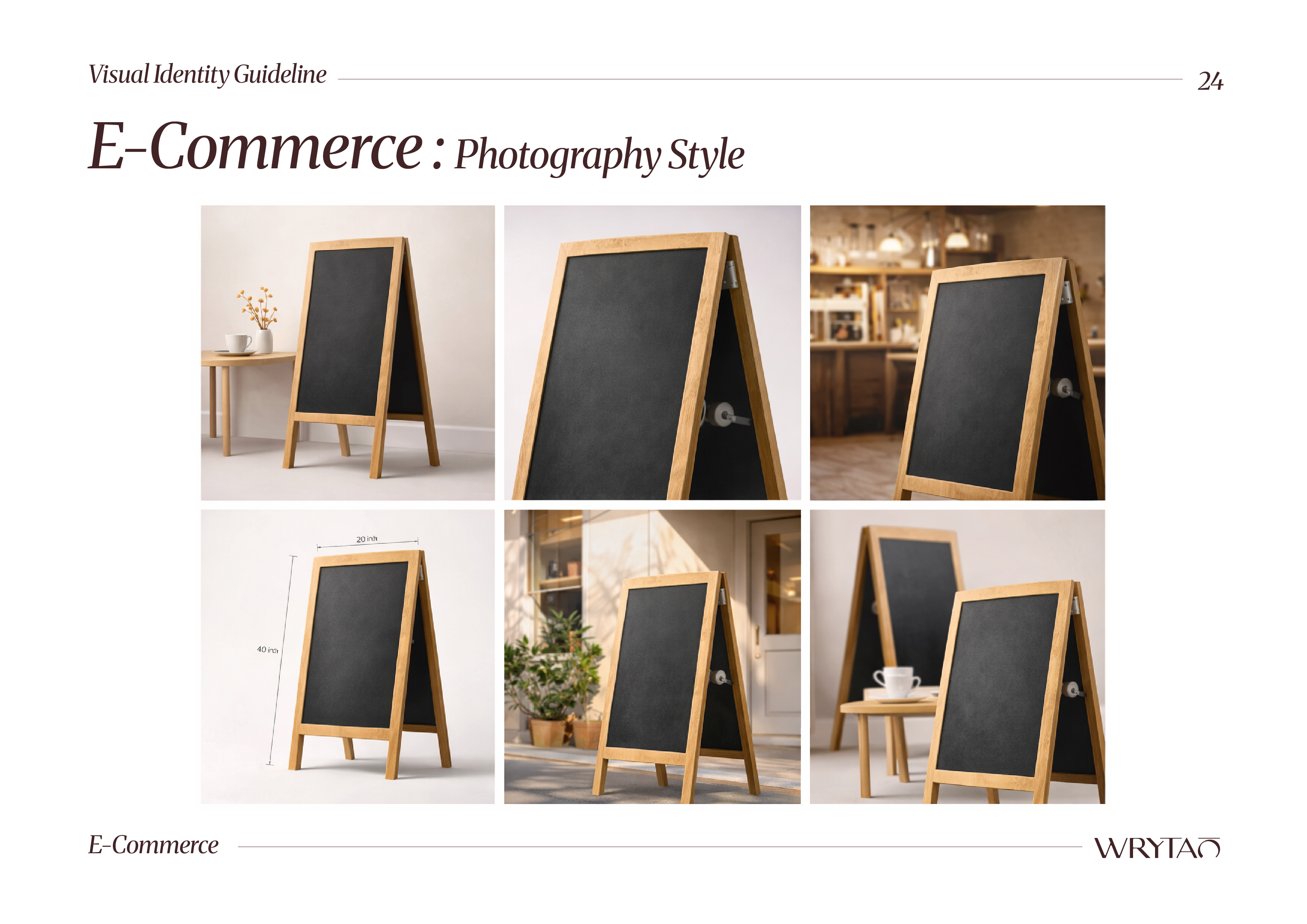
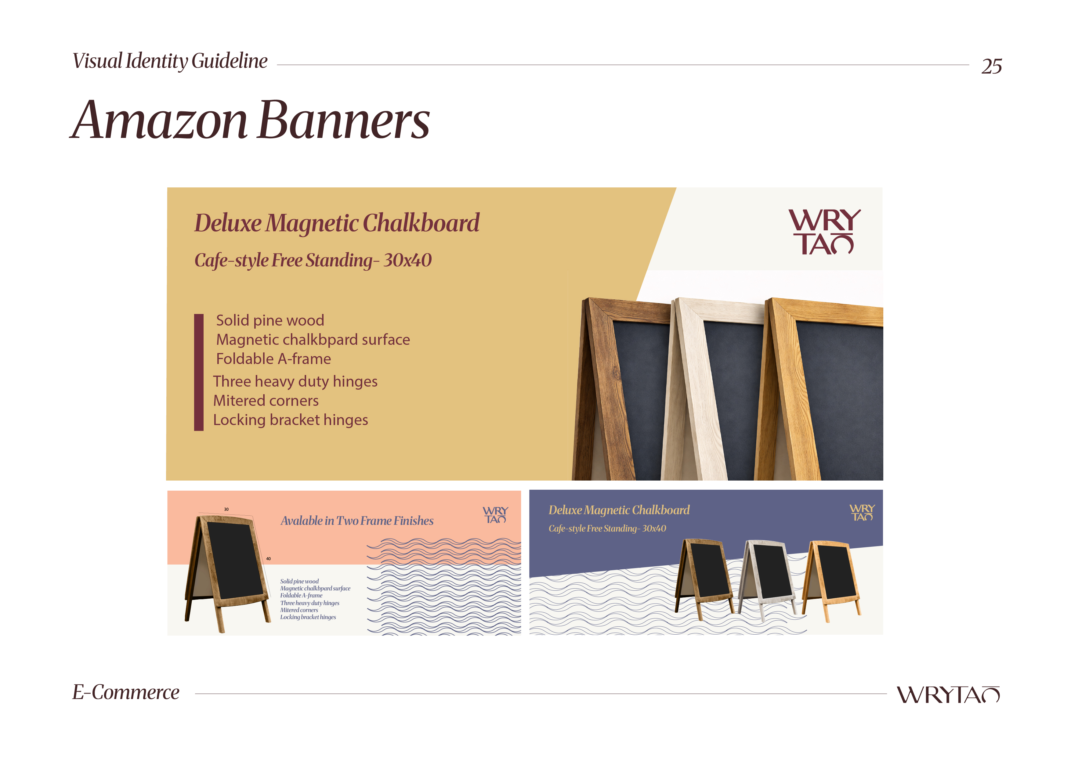
From notebooks to pencil sets and retail boxes, the system extends seamlessly into physical products:
- Clean layouts with strong hierarchy
- Color-coded product differentiation
- Premium yet approachable materials and finishes

Developed a visual direction for:
- Amazon banners
- Product photography
- Social media layouts
Ensuring consistency across digital sales channels.

Result

A cohesive, scalable brand that transforms everyday stationery into a design-forward product line.

  1. Strong shelf presence and digital recognition
  2. Clear differentiation from low-cost competitors
  3. Flexible system across SKUs and formats
  4. Elevated brand perception through design consistency

WRYTAO moves beyond utility and positions itself as a brand built around intentional writing and thoughtful design.

Vizomix is a results-driven design and marketing agency that helps brands grow, stand out, and convert.

Subscribe to our newsletter

© 2026 VIZOMIX LLC. All rights reserved.