Hello There!

We craft ideas into visuals that connect, inspire, and convert.

Overview

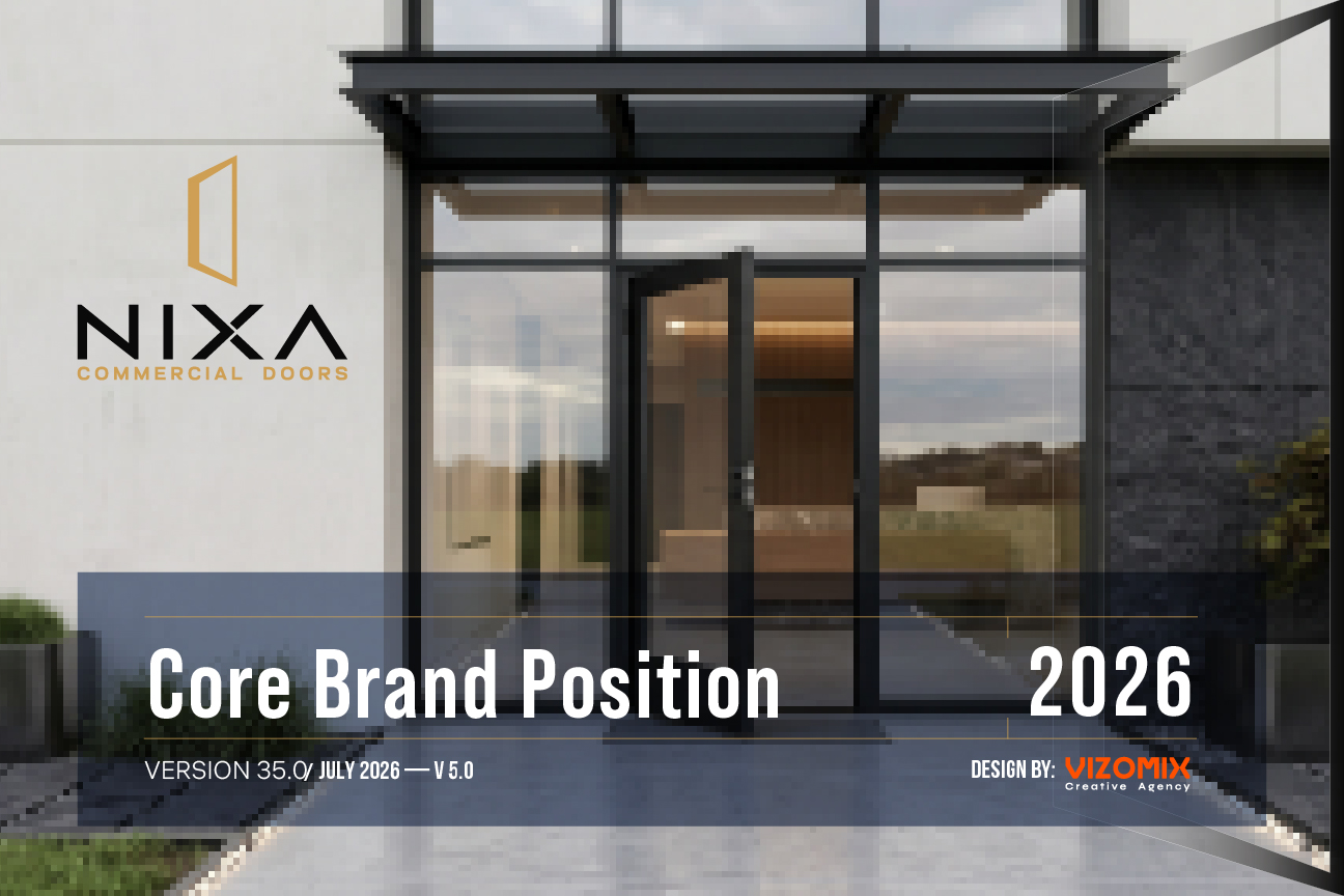
Nixa Commercial Doors Case Study: Building a Brand Ready for the Market

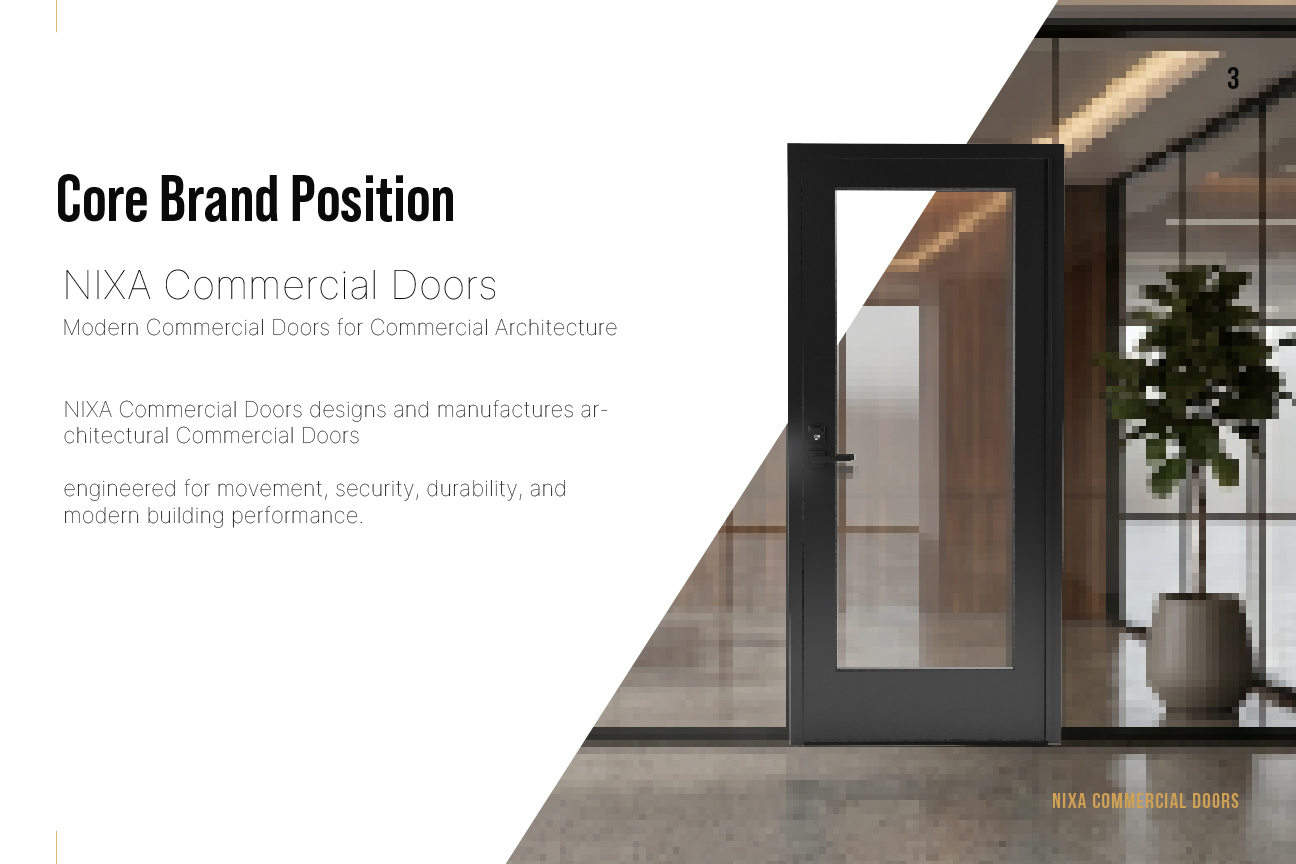
From the first impression to a product specification, Nixa needed a clear and consistent way to present its business. Vizomix connected the brand identity, product imagery, sales materials, and website into a shared foundation for the company.

Our work brought together branding and identity, 3D product visualization, catalogs and specification materials, website design and development, and search optimization. Each part supports the people who specify, buy, and install commercial doors.

Client

Nixa Commercial Doors

Date

April 2025

Services

Branding, Website Design, Product Visualization, Catalog & Spec Sheets, SEO Optimization

01

Challenge

Commercial door buyers care about what works: reliable products, clear specifications, and a company they can trust. Nixa's brand had to communicate those strengths without looking like every other industrial supplier. It also had to work for several different audiences and applications:

  • Feel credible on a specification sheet
  • Speak clearly to architects, contractors, and facility teams
  • Work naturally across sales and technical materials
  • Balance technical precision with an approachable voice
  • Give the company room to grow beyond one door category

Nixa needed to look established and capable, while keeping the identity clean enough to sit comfortably beside architectural drawings, hardware schedules, and modern storefront systems.

02

Strategy & Design

We treated the identity, imagery, documents, and website as parts of the same customer experience. The aim was to make Nixa recognizable at every stage, with clear product information and a consistent presentation from the first introduction to a sales conversation.

An Identity for Commercial Architecture

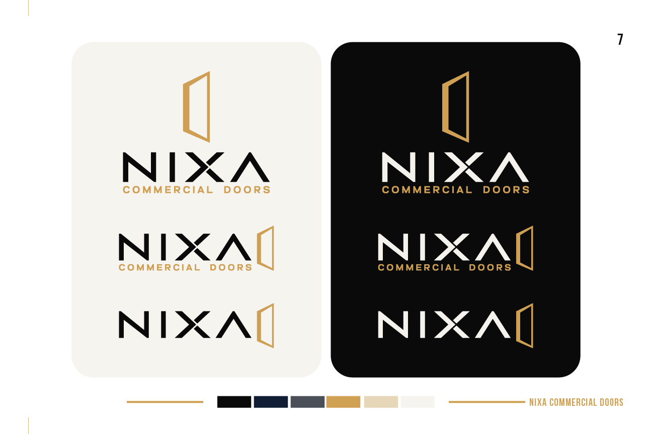
We developed the logo and wordmark to give Nixa a distinct presence in a technical market. The identity had to remain recognizable on a product label, a drawing, a website, and a building sign.

Horizontal, stacked, and symbol-only arrangements give the team options for different spaces. The brand presentation below shows the visual decisions and how they work together.

Color & Typography

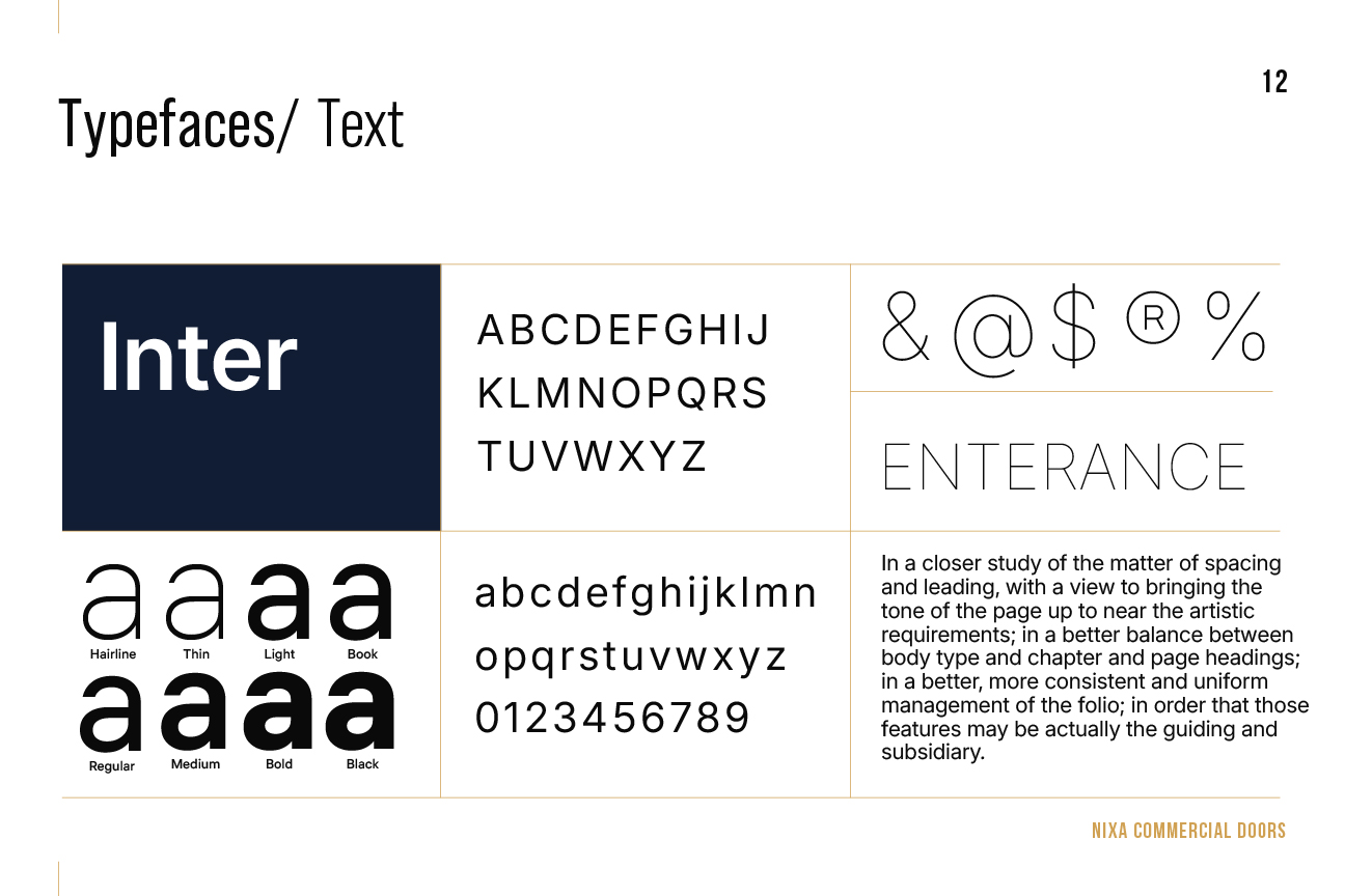
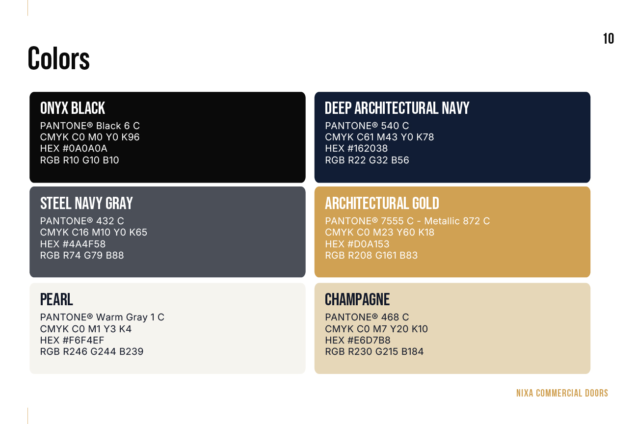
Deep navy gives Nixa a dependable, architectural base. Gold adds distinction without making the system feel decorative.

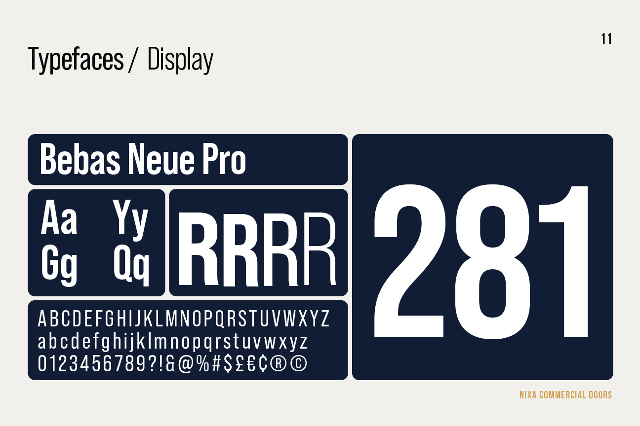
Bebas Neue Pro handles the bold display moments. Inter carries the working text, where clarity matters most: web pages, specifications, captions, labels, and other day-to-day applications.

Graphic System

We extended the identity into a set of lines, crops, and patterns that gives Nixa a recognizable rhythm without locking the brand to one product or application. The system works across layouts, labels, technical pages, and presentation materials.

Stationery

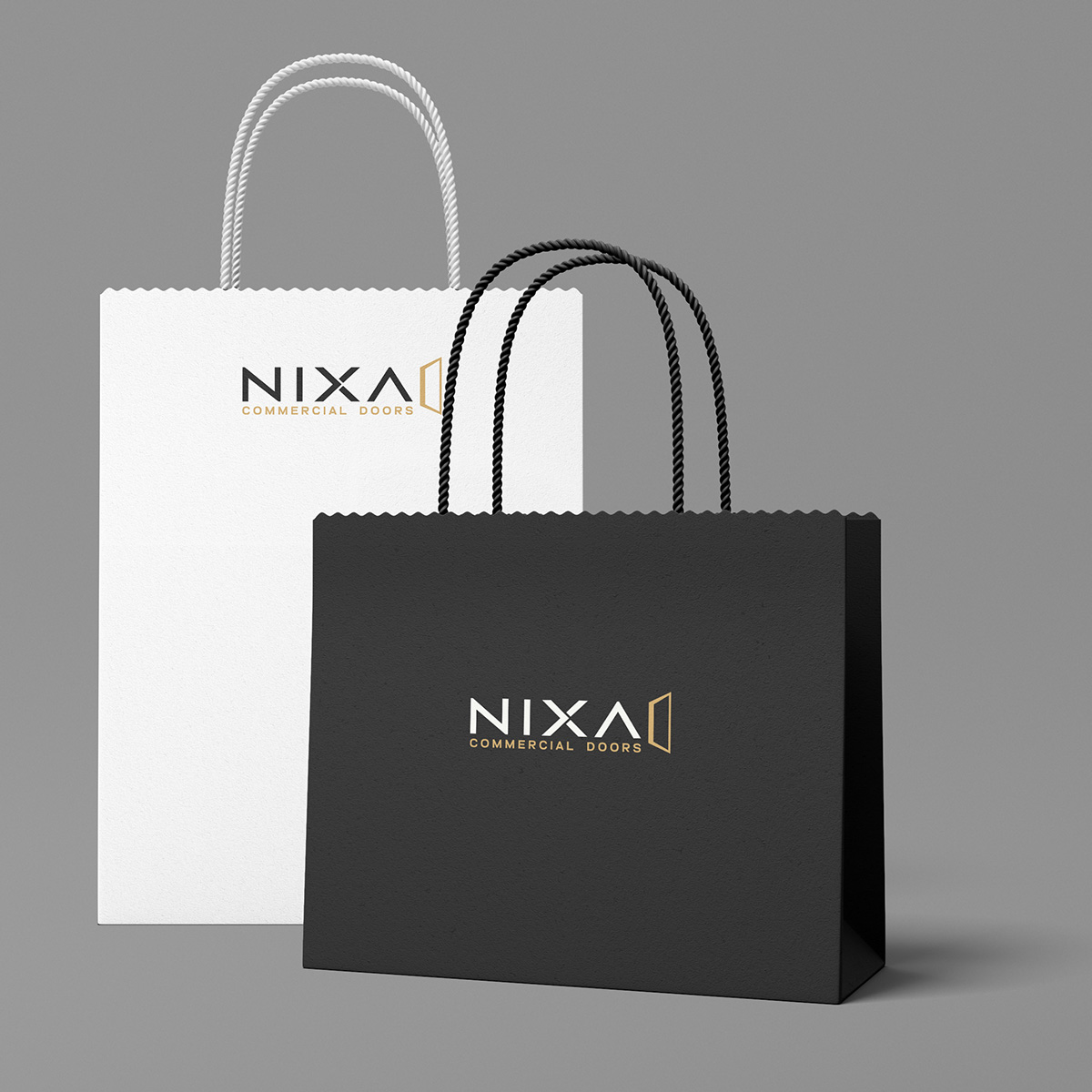
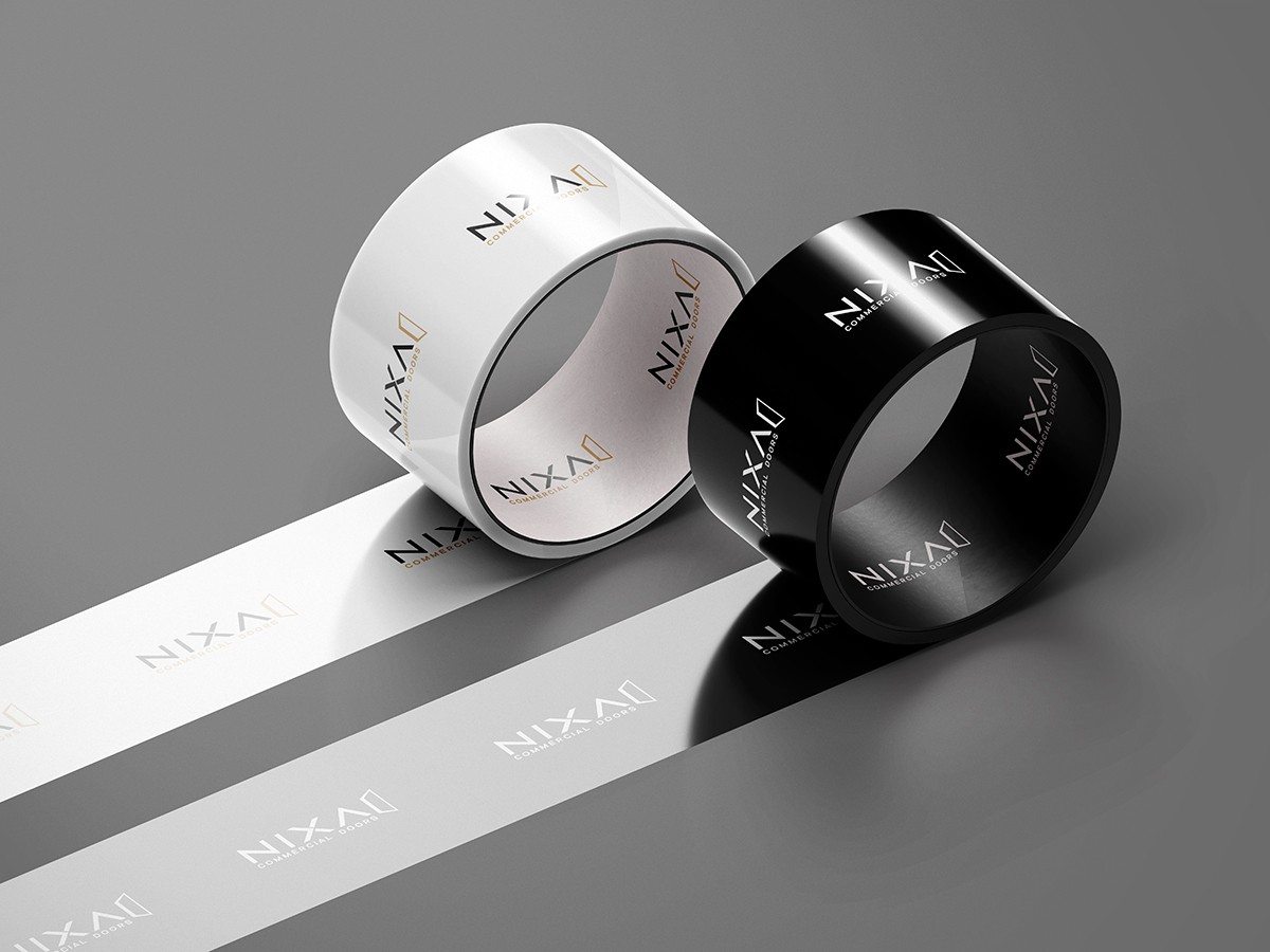
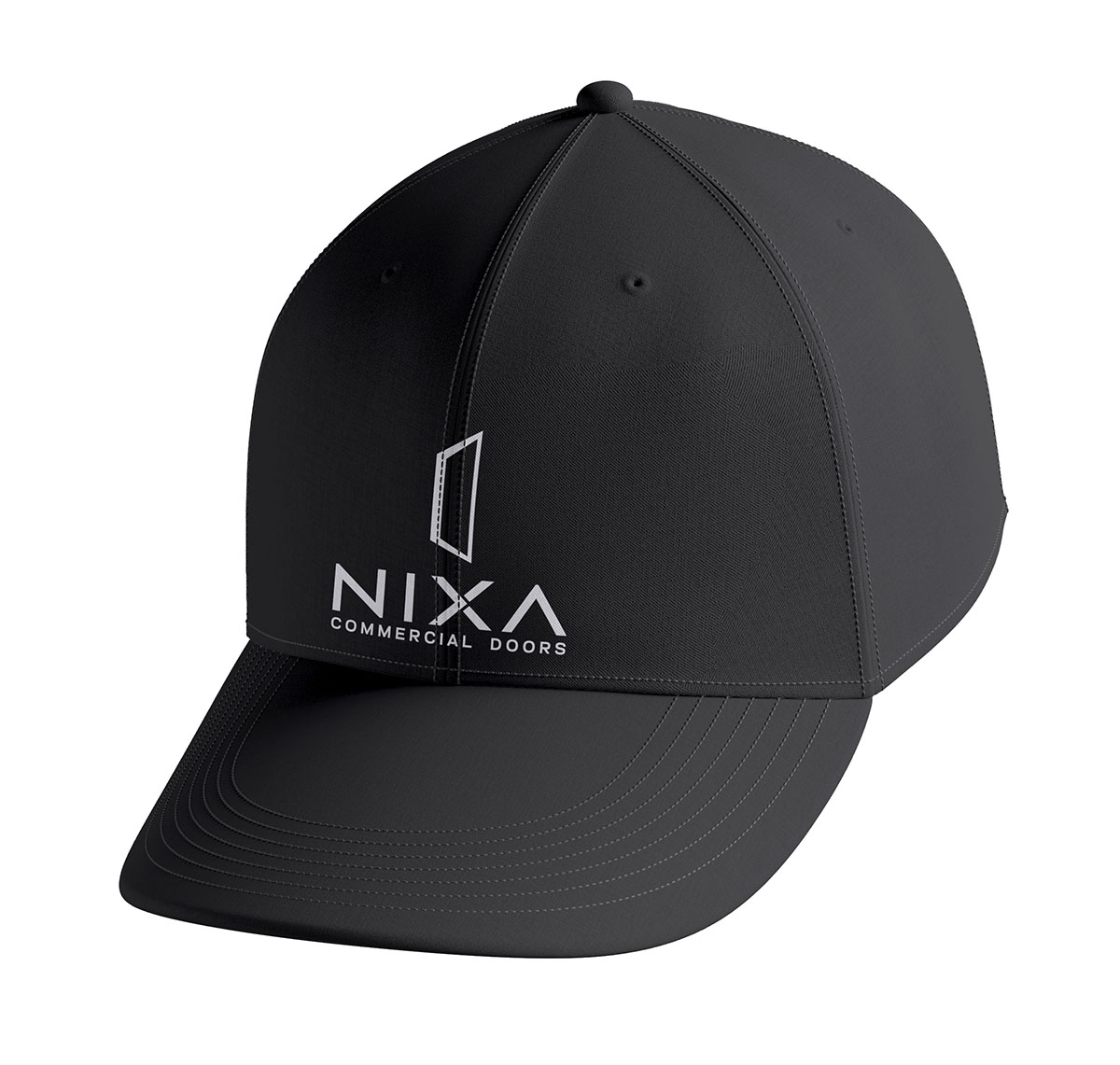
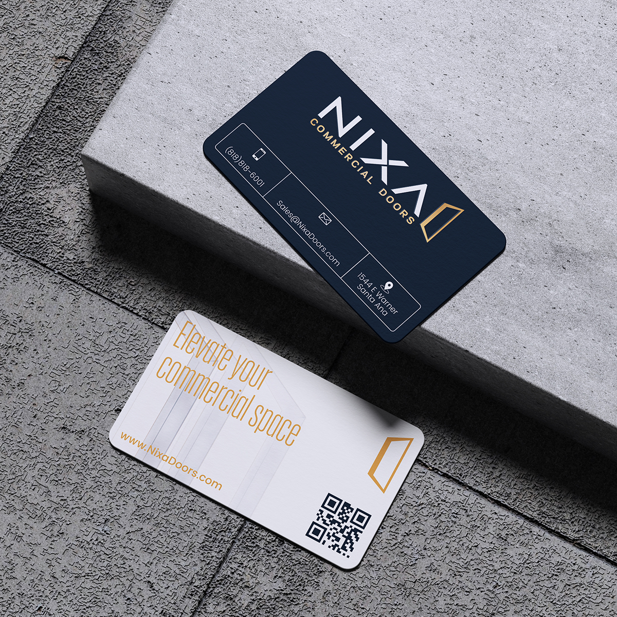
Brand systems prove themselves in everyday use. We applied Nixa’s identity to business cards, letterhead, envelopes, packaging, profile graphics, and the product catalog. That way, proposals, shipments, and follow-up emails all feel connected.

  • Business cards
  • Letterheads
  • Envelopes
  • Packaging applications
  • Profile icons
  • Catalog

3D Product Visualization

Commercial doors are difficult to photograph consistently, especially when the range includes multiple configurations and small hardware details. We built a reusable library of 3D product images that shows each system through clean catalog views, close-up details, and installed architectural scenes. The models stay faithful to the real geometry, so the visuals support sales and technical communication instead of serving as decoration.

  • Clear catalog-ready product views
  • Close-ups that show hardware and construction
  • Installed scenes with architectural context
  • Reusable variations for different door configurations

Because the same source assets can be reused and reconfigured, Nixa can keep its product imagery consistent as the catalog grows.

03

The Brand in Detail

A visual identity becomes useful when the whole team can work with it. The brand presentation brings the logo, typography, color, and layout rules together in one reference. These pages show how Nixa’s identity carries across different formats, from a compact product label to a large architectural presentation. Consistency comes from clear, repeatable decisions about scale, contrast, and hierarchy.

04

A Website That Helps Buyers Take the Next Step

A commercial door website has to answer practical questions. What systems are available? Where will they be used? How does a buyer get help with a project?

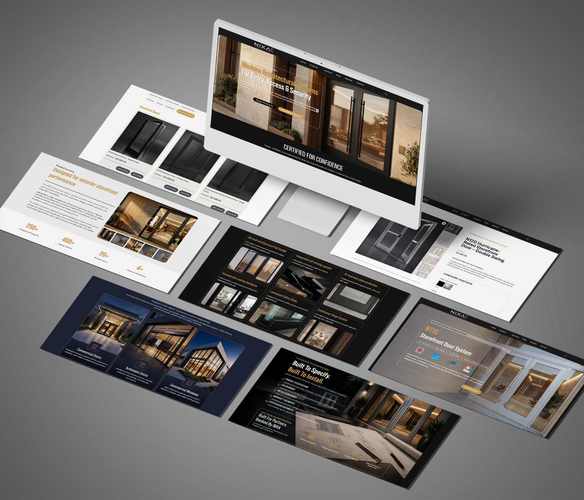
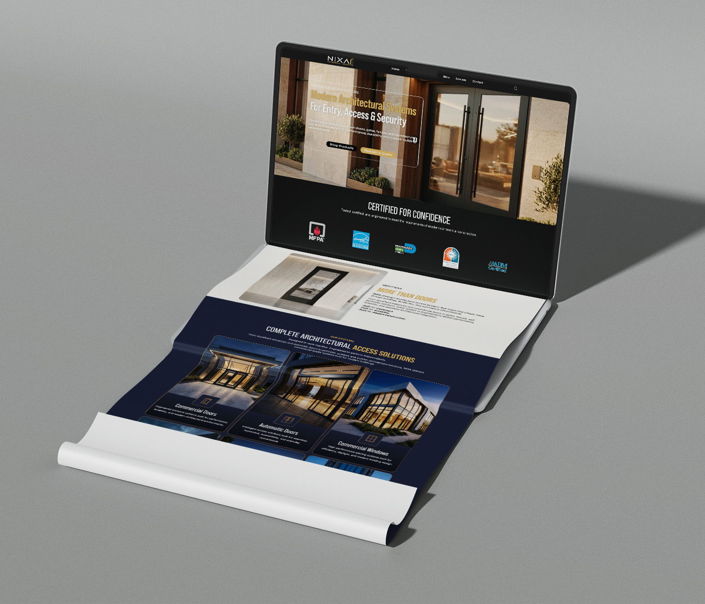
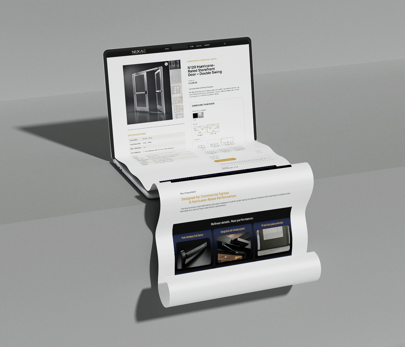
We brought Nixa’s identity and product imagery into a website organized around those decisions. Product and application pages introduce the range, while contact and quote pathways connect visitors with the sales team. Responsive layouts carry the same experience from a desktop specification review to a quick check on a phone.

We also set up inquiry forms, spam protection, email notifications, and the foundations for search and analytics. These systems support the path from a first visit to a project conversation.

05

Tools for the Sales Conversation

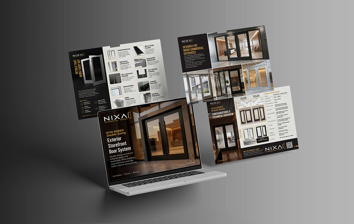
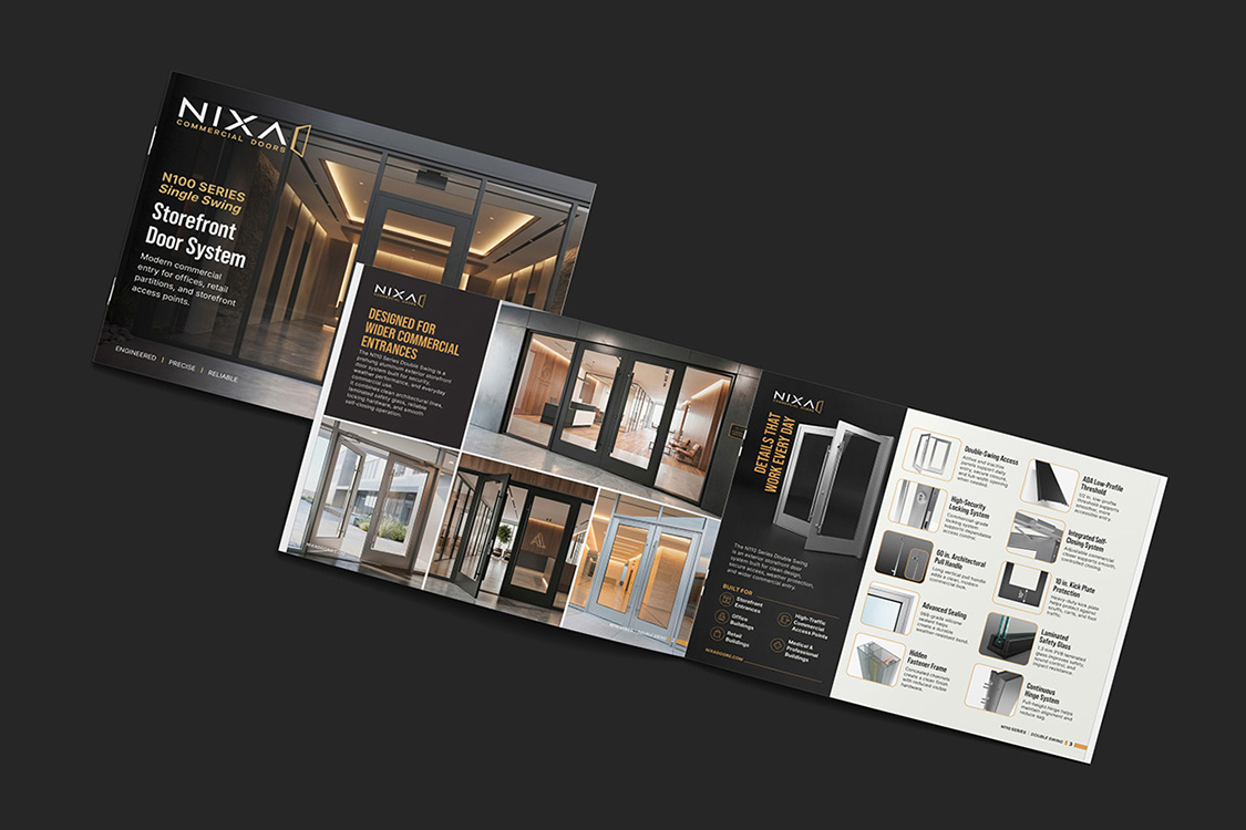
A catalog needs to help someone compare products. A specification sheet needs to make the details easy to find. We brought the identity and product renders into sales and technical materials with those different jobs in mind. Clear product views, consistent naming, and a readable hierarchy give the sales team a shared way to present the range. The same assets can support proposals, customer follow-ups, product listings, and future catalog updates.

06

Preparing for the Next Stage

The work continued beyond the visible pages. Search Console, sitemap submission, analytics, and on-page search optimization now help Nixa understand how people find and use the website. This gives the team a clearer starting point for future content, product launches, and campaigns. Nixa now has a coordinated brand, a reusable image library, and a website supported by tools for inquiries and measurement.

07

Built to Grow

Nixa now has a coordinated set of tools for presenting its business: a recognizable identity, a reusable product-image library, sales and technical materials, and a website that brings them together.

The team can use these assets every day and expand them as the product range grows.

A Mark That Belongs to Nixa

The new identity gives Nixa a recognizable symbol that remains clear on architectural drawings, product labels, digital screens, and large-format applications.

One Brand, Wherever It Appears

The same visual language now carries from the website and catalog to labels, packaging, proposals, and presentation materials.

Made for a Technical Audience

Architects, contractors, developers, and facility teams can read the brand quickly: precise, dependable, and built around real commercial-door work.

Ready to Grow With the Catalog

The flexible logo and graphic system can support new door types, storefront systems, and access products without starting over.

Let’s Build Your Next Chapter

Bringing a technical product to market? We can help connect the brand, product visuals, and website.

Vizomix design and marketing agency logo

Vizomix is a results-driven design and marketing agency that helps brands grow, stand out, and convert.

Subscribe to our newsletter

© 2026 VIZOMIX LLC. All rights reserved.